
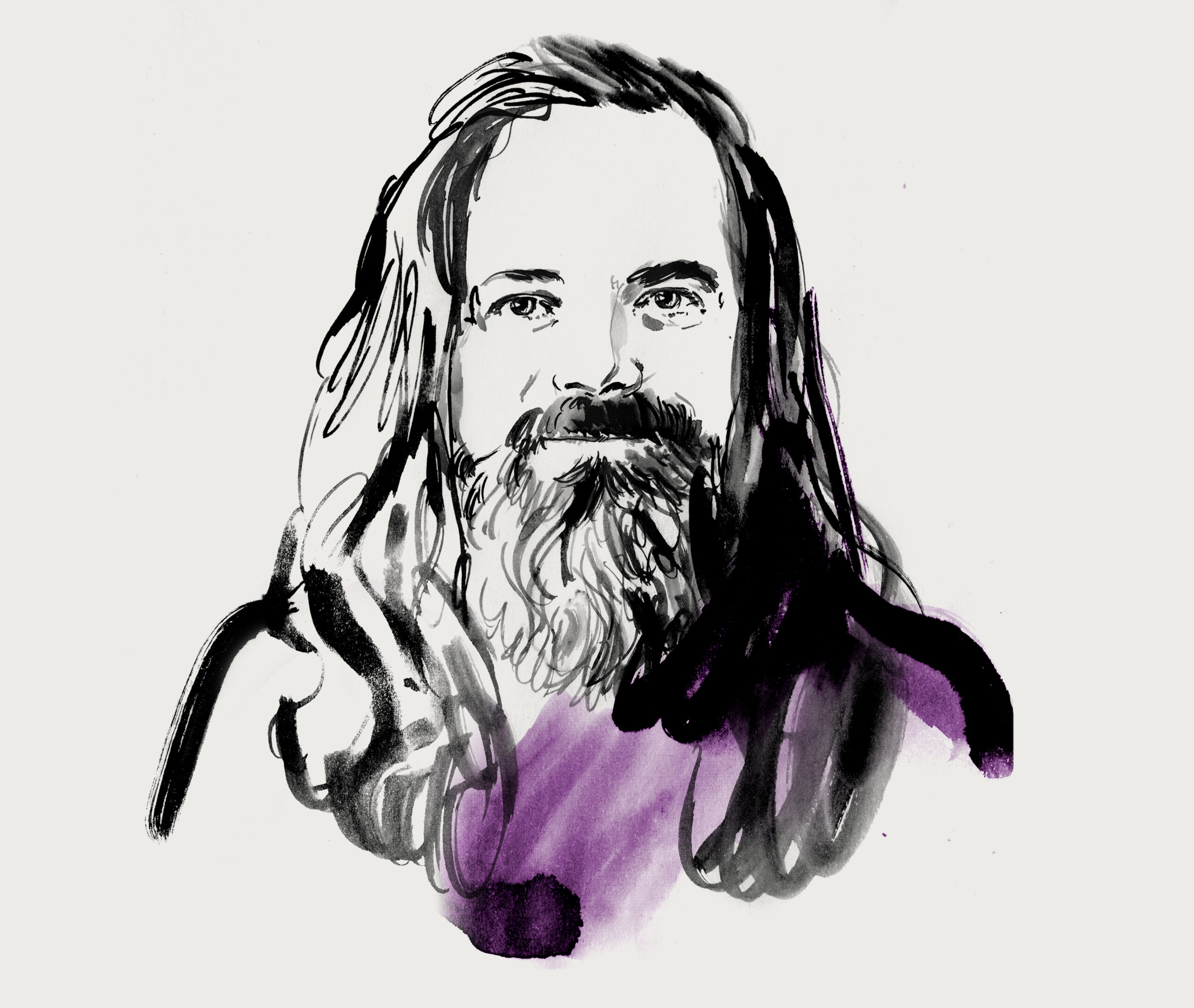
Arne Depuydt
Design in the Age of Algorithms:
Why Intuition Still Matters
As editorial teams race to automate production and personalize content, the question arises: what’s left for human judgment? In this interview, Belgian designer Arne Depuydt reflects on his time at De Morgen, a leading and award-winning newspaper from Antwerp, the ethics of AI, and why good design remains an act of resistance against simplification.
Interview by Thomas Weyres
Illustration by Elisabeth Moch
I met Arne in Minneapolis, USA—after a long day at the Star Tribune offices, we ended up in a bar in the evening and quickly realized that over the past ten years we had both worked on very similar topics and share a very similar perspective on many of them. Since then, we have been in occasional contact and are hoping for a joint project in 2026. The interview was conducted via email.
Many years ago — if I remember correctly, it was in Antwerp, Belgium — I bought a copy of De Morgen, and I was completely blown away. The visual intelligence of the layout, the storytelling, the attention to detail — it was unlike anything I had seen in a daily newspaper. It felt so considered and smart that I could hardly believe it was a standard daily. What was your role at De Morgen at that time?
It depends when. If you were in Antwerp around 2010, I was part of a super nice layout crew. We were also friends who had studied at the same school — LUCA School of Arts in Ghent.
We had the opportunity to experiment with a lot of new ideas. We made many mistakes in the beginning, but slowly we started to find the perfect balance between freshness and solid layout principles, without losing sight of readability. We were given a lot of responsibility as layouters — more than I’ve seen at other newspapers. It was also a time when newspapers were a bit boring, and the pressure of the digital age forced publishers to really step up. That’s when storytelling and layout started to evolve together.
In those years, I moved into the role of art director. In 2013–14, I was part of a major redesign. The idea was to create a small, magazine-like newspaper — but a few months before the deadline, the publishers changed their minds. Too bad, because it looked really cool and would have been revolutionary.
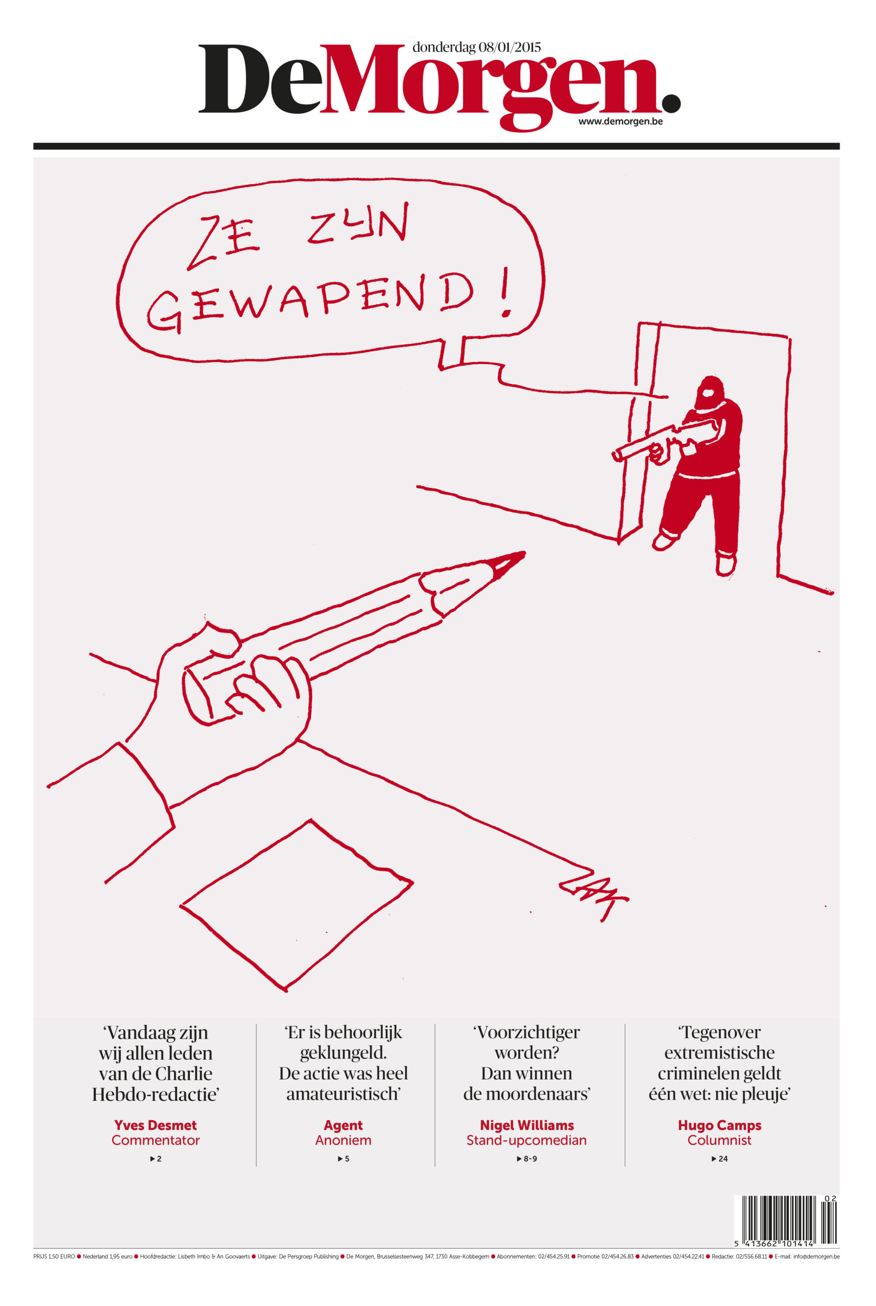
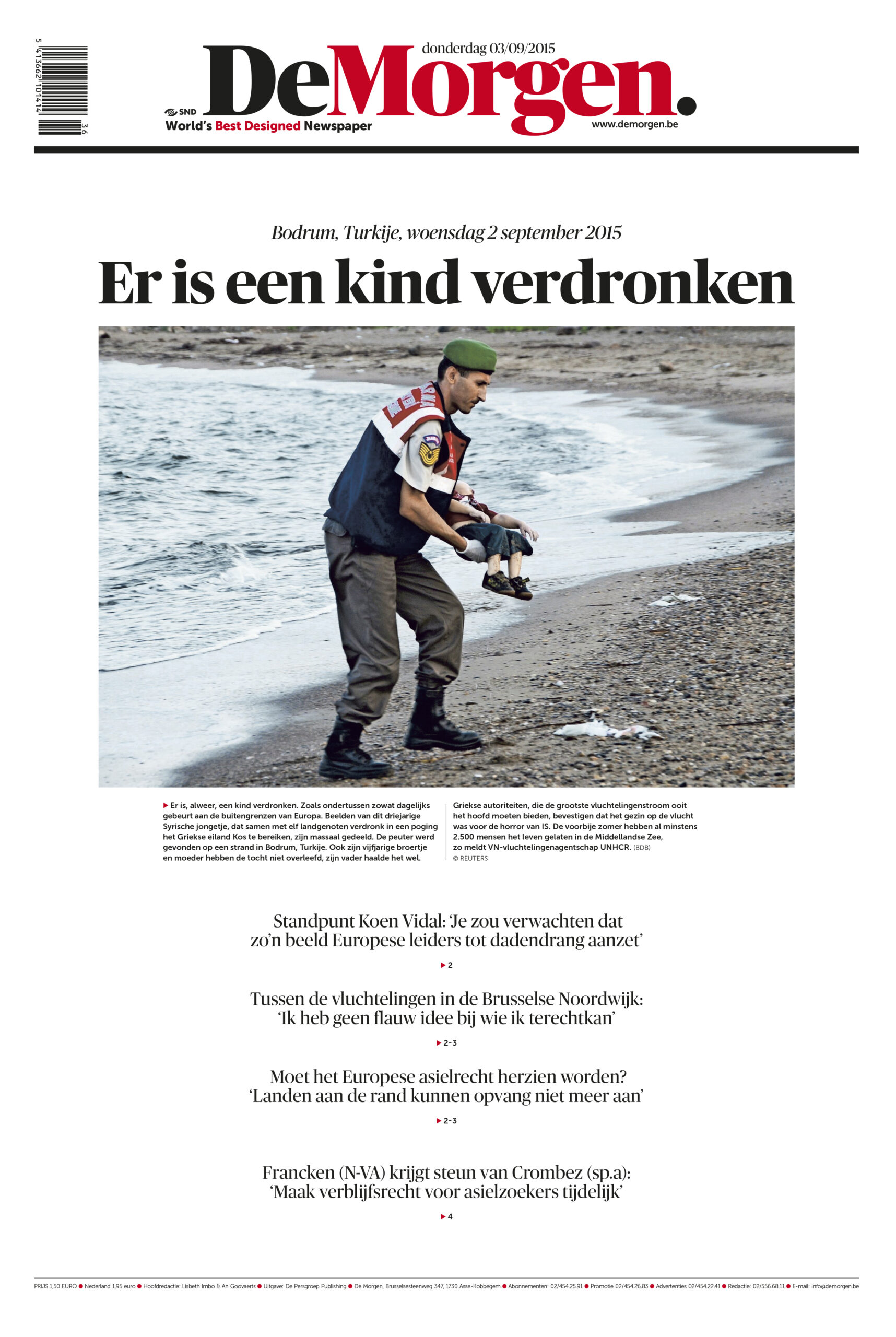
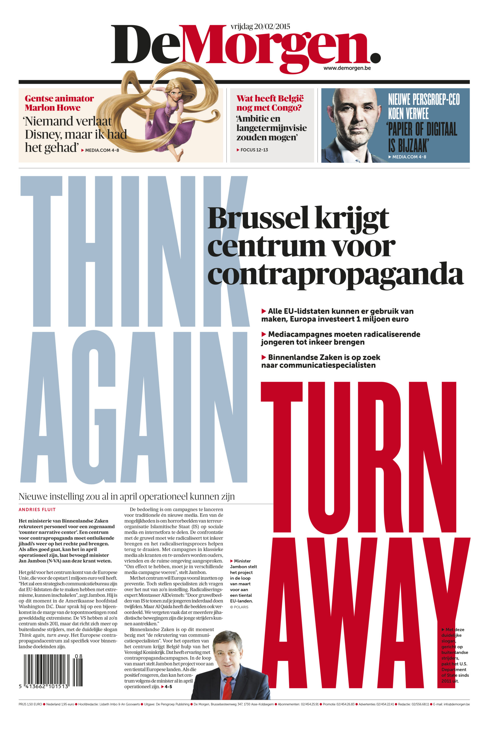
Frontpages of De Morgen:
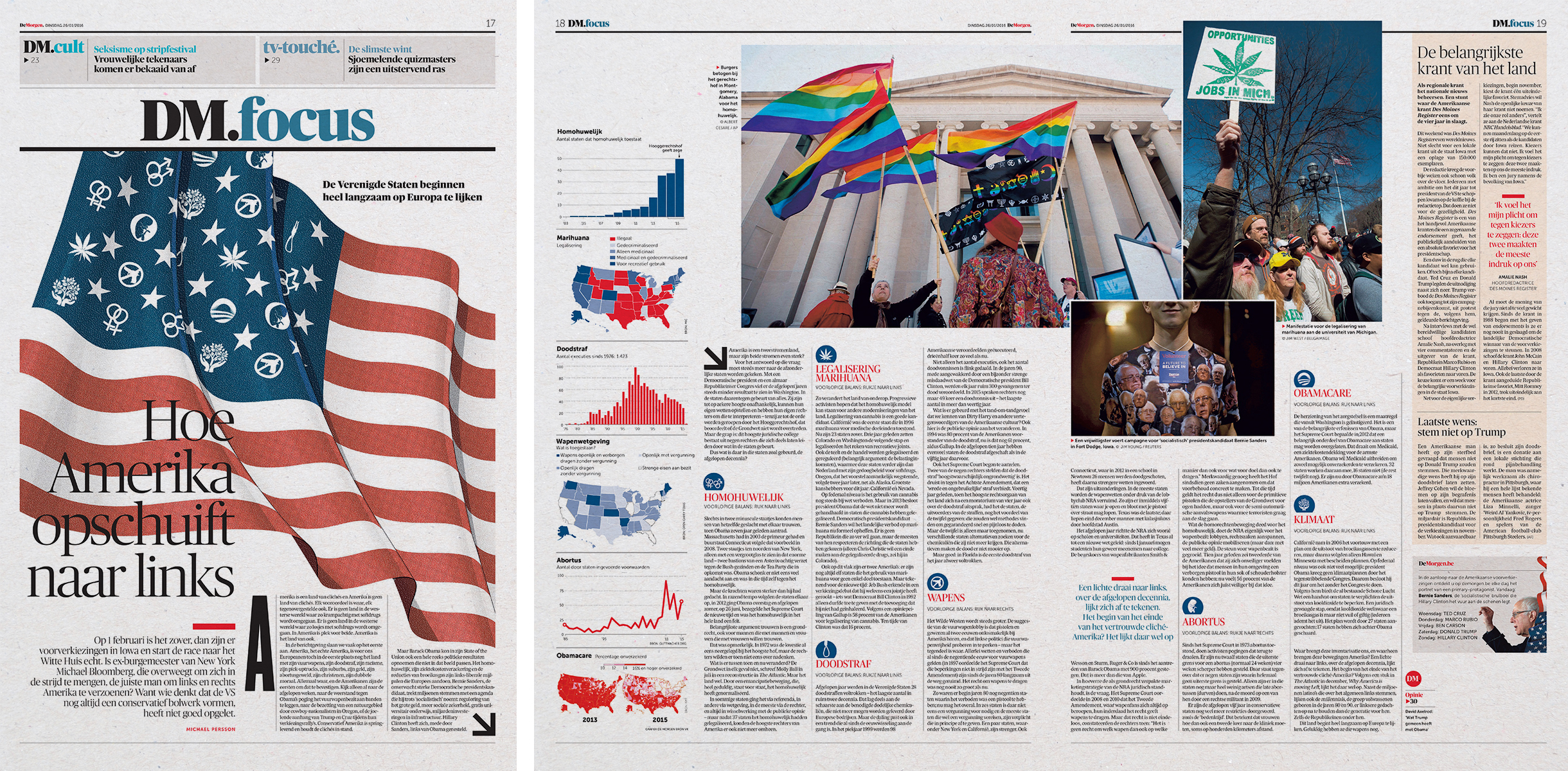
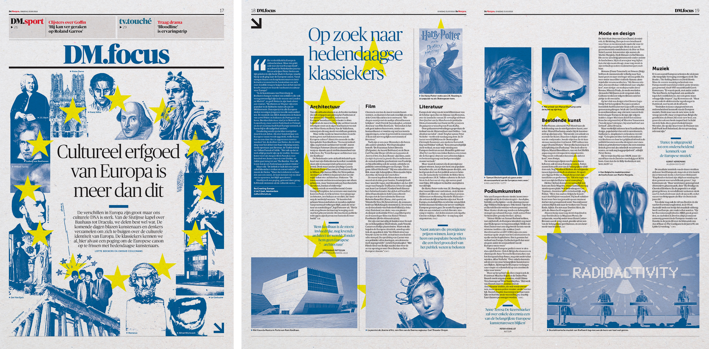
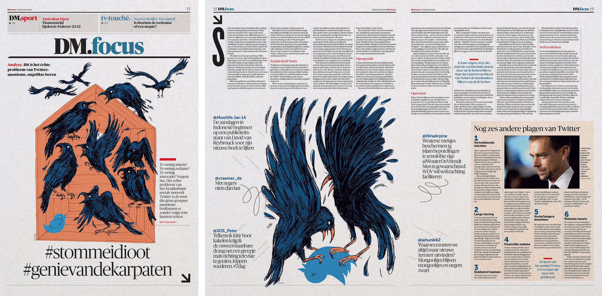
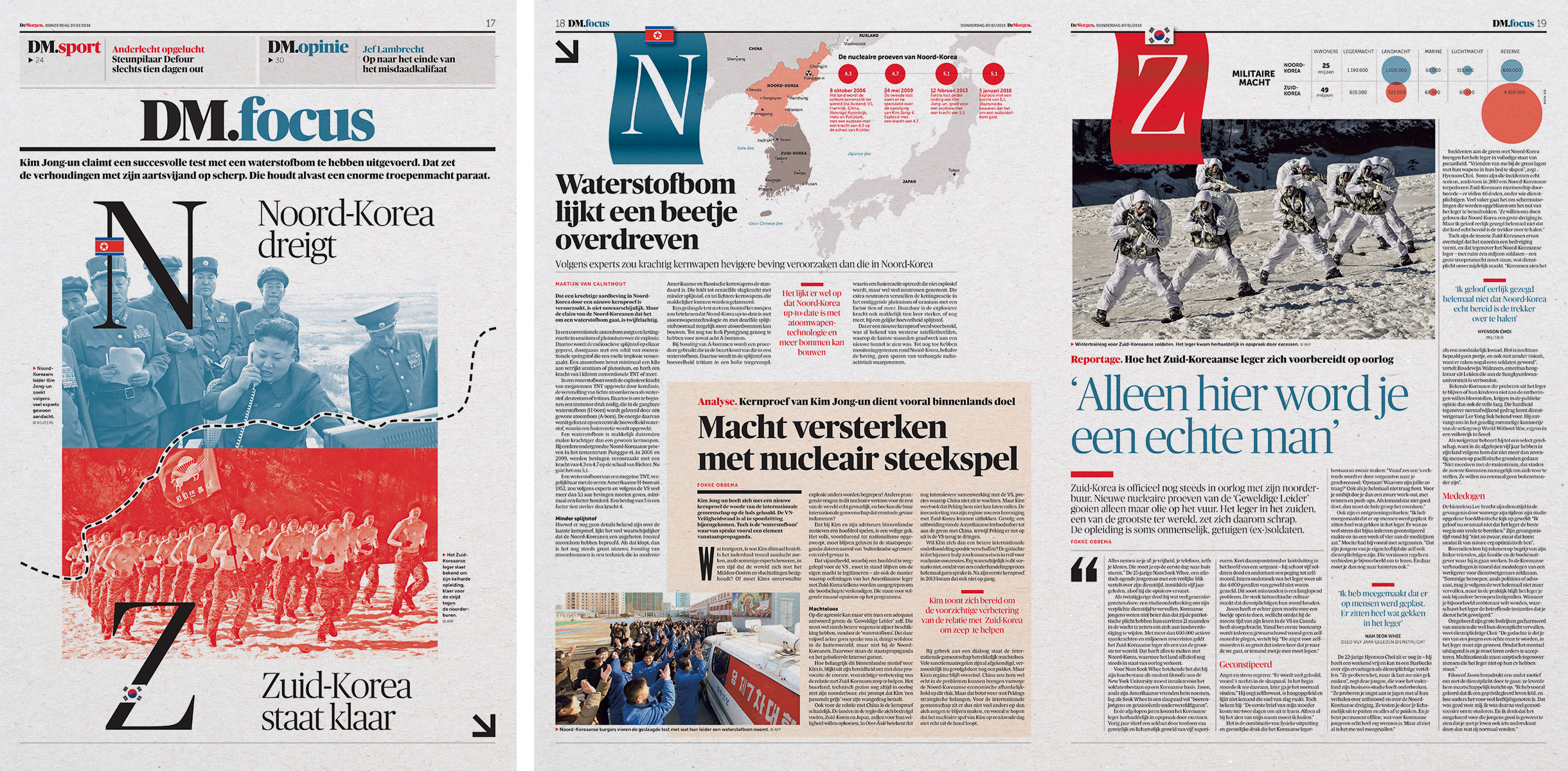
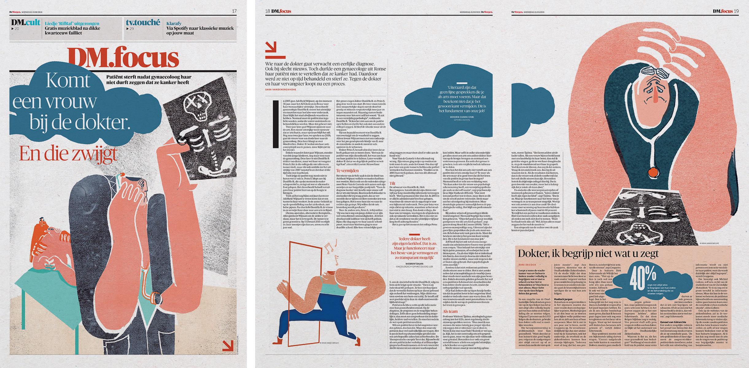
Section frontpages and spreads of DM.focus of De Morgen:
You were involved in a redesign of De Morgen around 2013, which went on to win numerous awards — including European Newspaper of the Year and World’s Best Designed Newspaper in 2014, if I’m not mistaken. Then, about eight years later, in 2022, you led another redesign. Why did the newspaper decide to do a new redesign relatively soon after such a successful one? And how did the brief or overall goals differ between the two redesigns?
One reason was that our printing press was shutting down, so we had to move production to the Netherlands. All DPG Media newspapers there needed to be in the same format, so we changed from Berliner to tabloid. A smaller format required a new approach.
At the same time, we wanted to shift from a print-first to a digital-first newsroom. The biggest impact was that all the stories appearing in print now also needed to work online. That’s why we no longer include short, telex-style news items in print—only longer pieces.
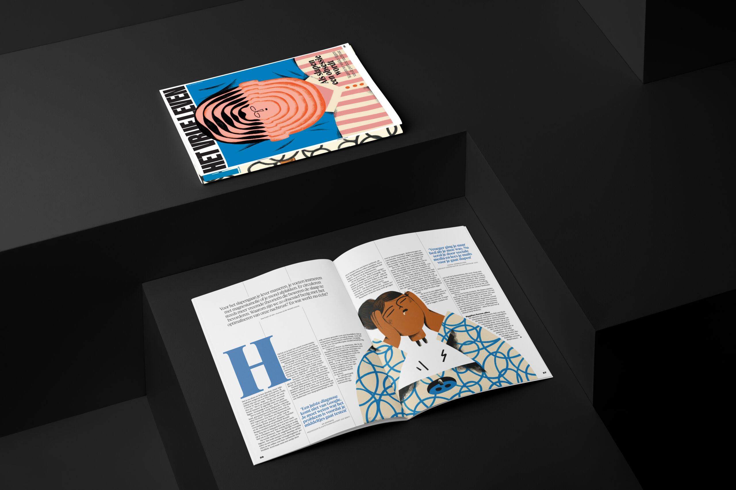
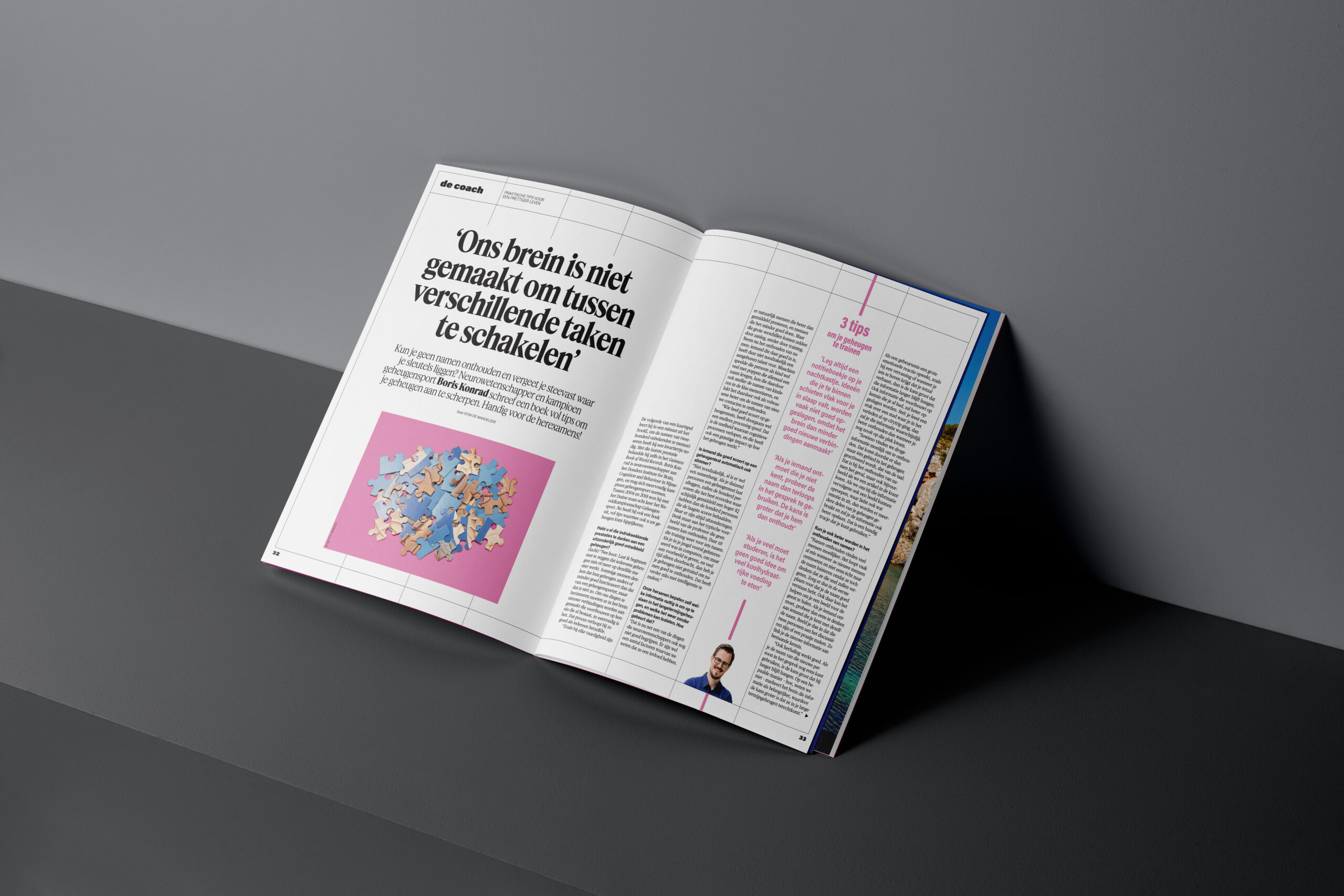
We also needed a more structured newspaper. In the old setup, we started every day from scratch, with little consideration for article length, which often led to chaos. The new modular system allowed articles of specific lengths to fit together like a puzzle, using layout elements from a shared library. This made it easier for layouters to build pages without having to redesign everything from zero. The saved time could then be invested in pages with major stories — especially in our “Het Vrije Leven” section, where creativity was encouraged.
Sed diam nonumy eirmod tempor invidunt ut labore et dolore magna aliquyam erat, sed diam voluptua. At vero eos et accusam et justo duo dolores et ea rebum.
Stet clita kasd gubergren, no sea takimata sanctus est Lorem ipsum dolor sit amet. Lorem ipsum dolor sit amet, consetetur sadipscing elitr, sed diam nonumy eirmod tempor invidunt ut labore et dolore magna aliquyam erat, sed diam voluptua. At vero eos et accusam et justo duo dolores et ea rebum. Stet clita kasd gubergren, no sea takimata sanctus est Lorem ipsum dolor sit amet.
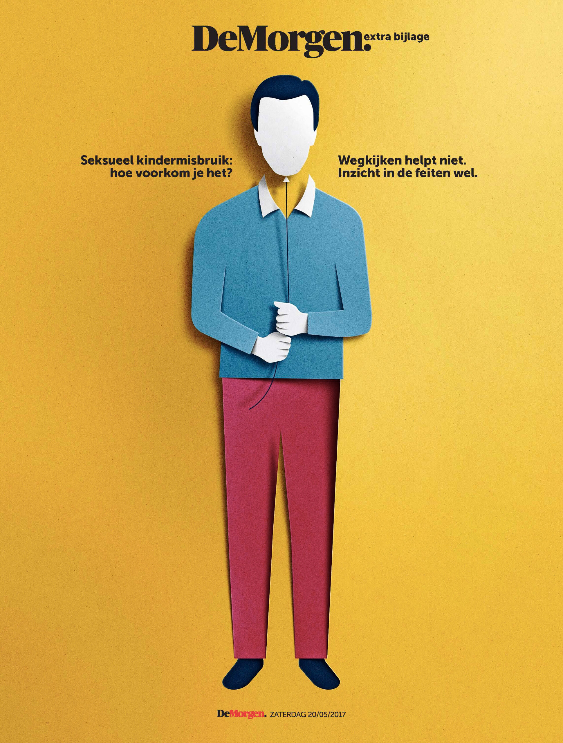
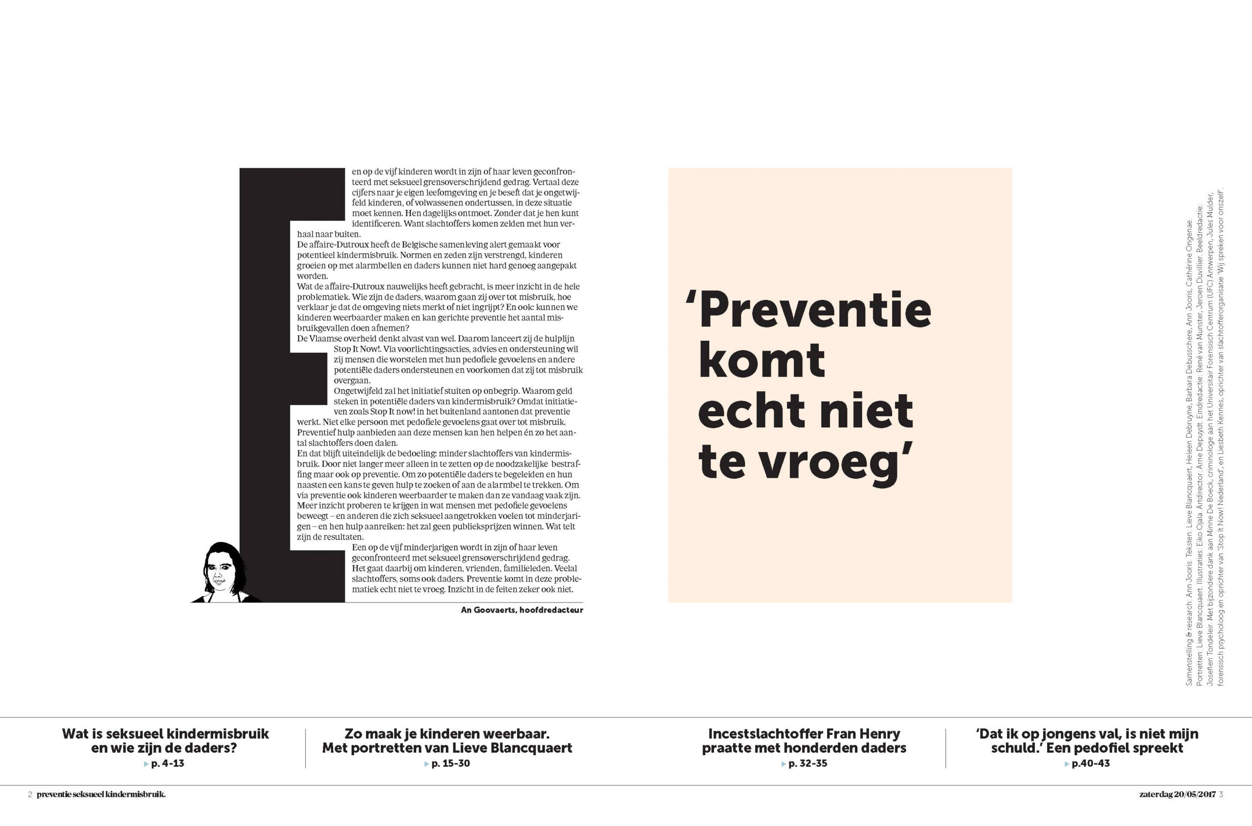
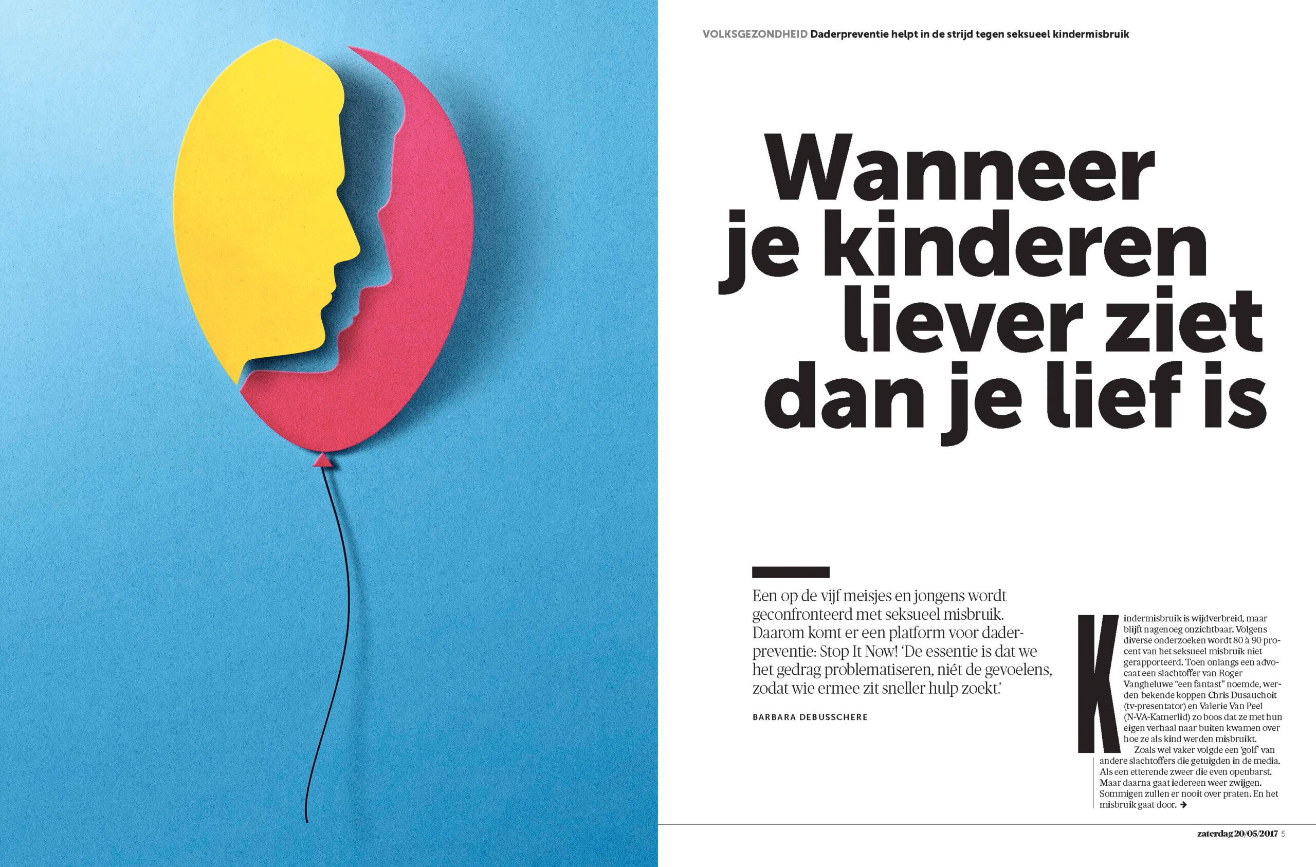
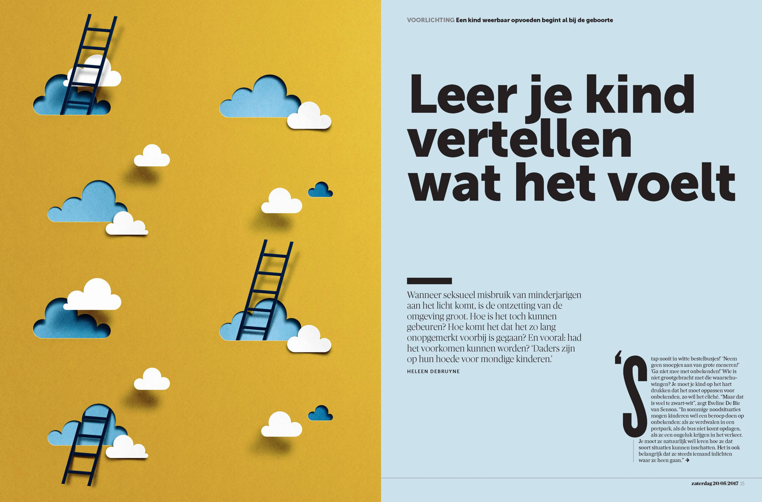
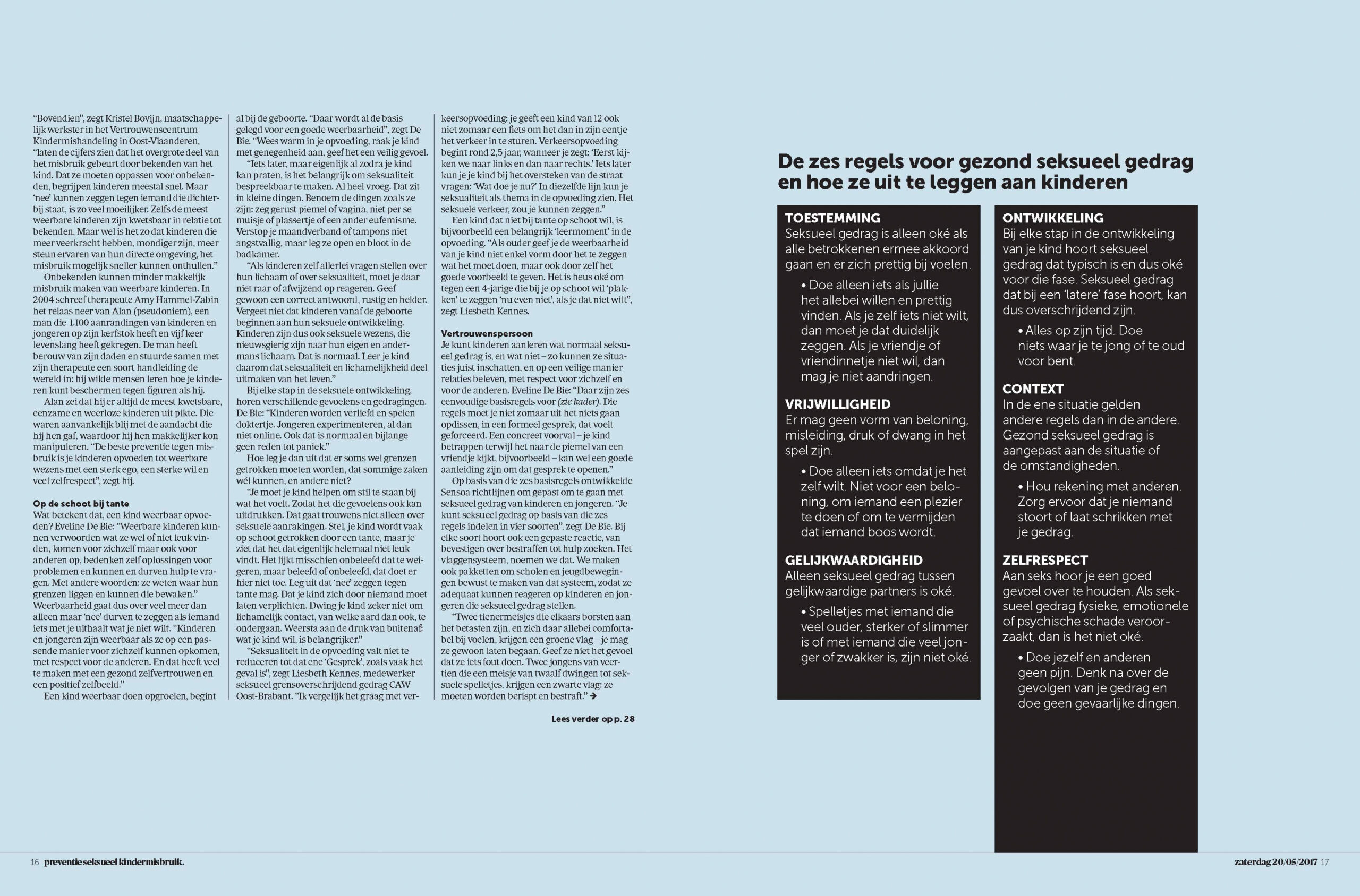
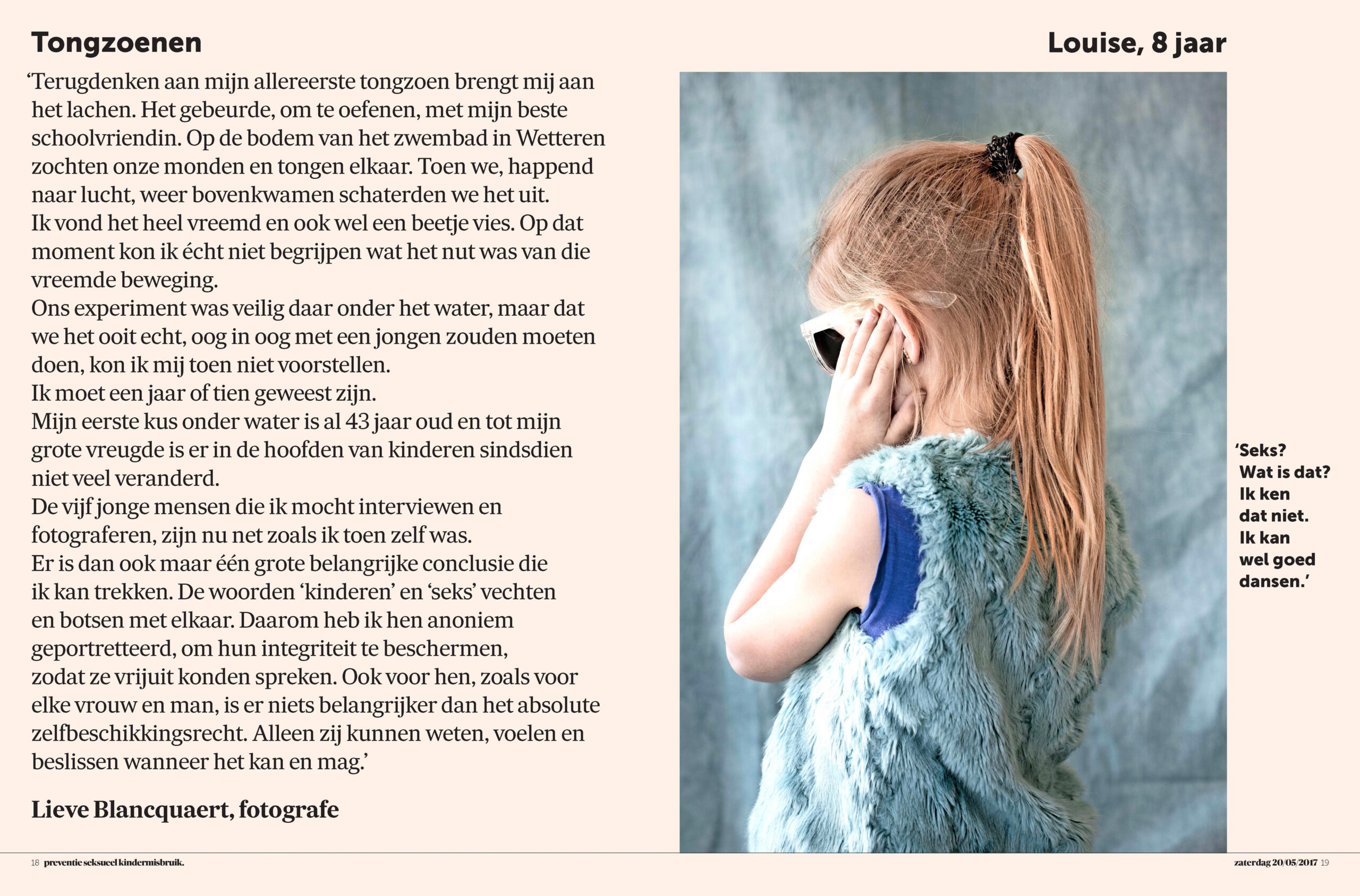
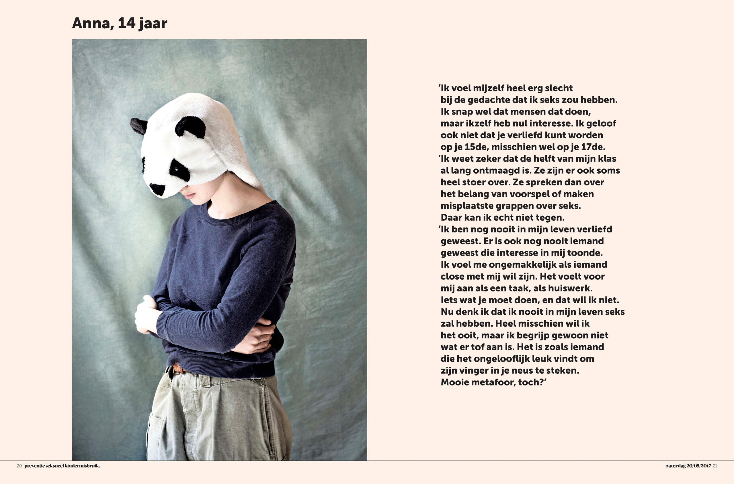
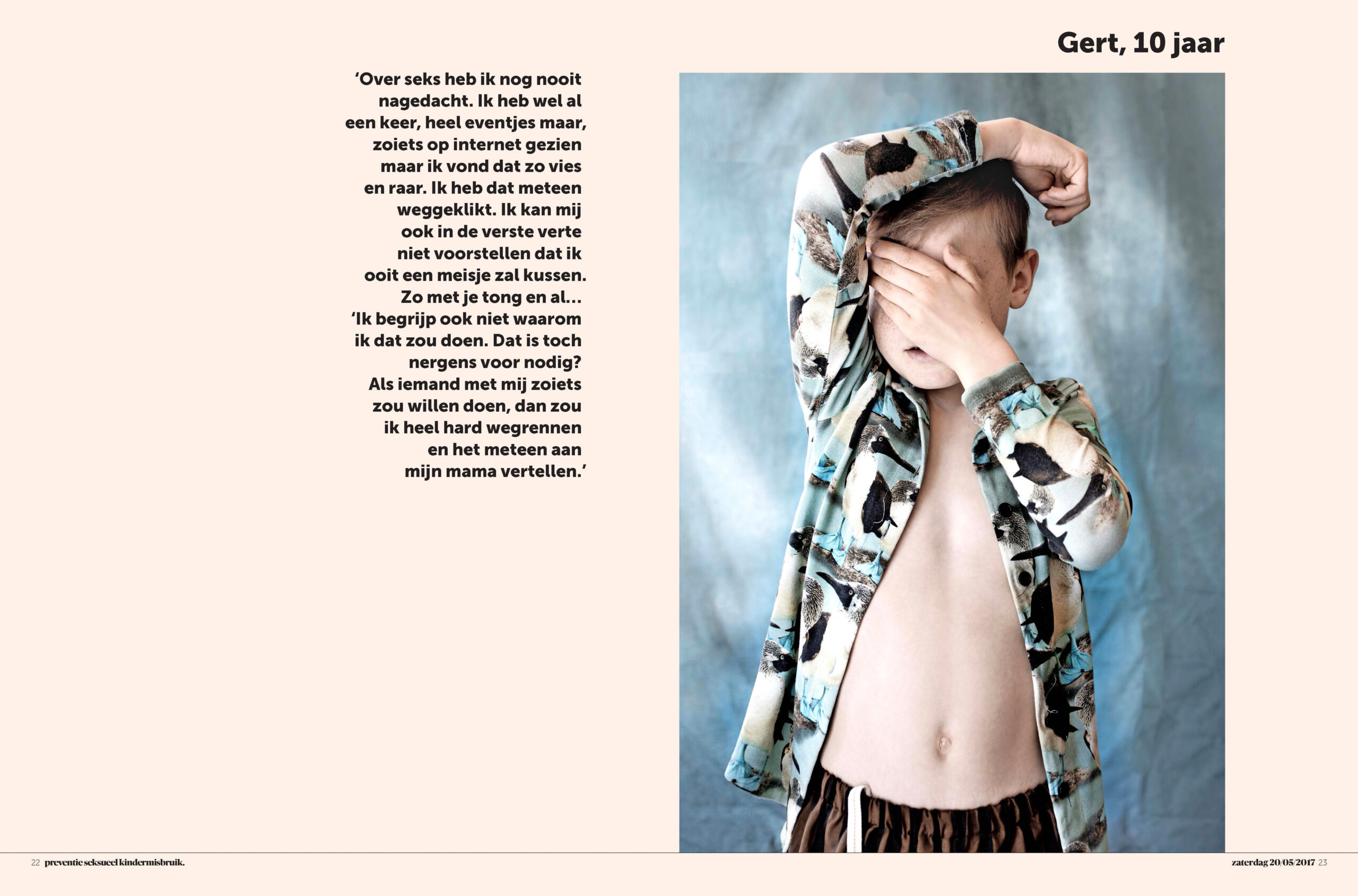
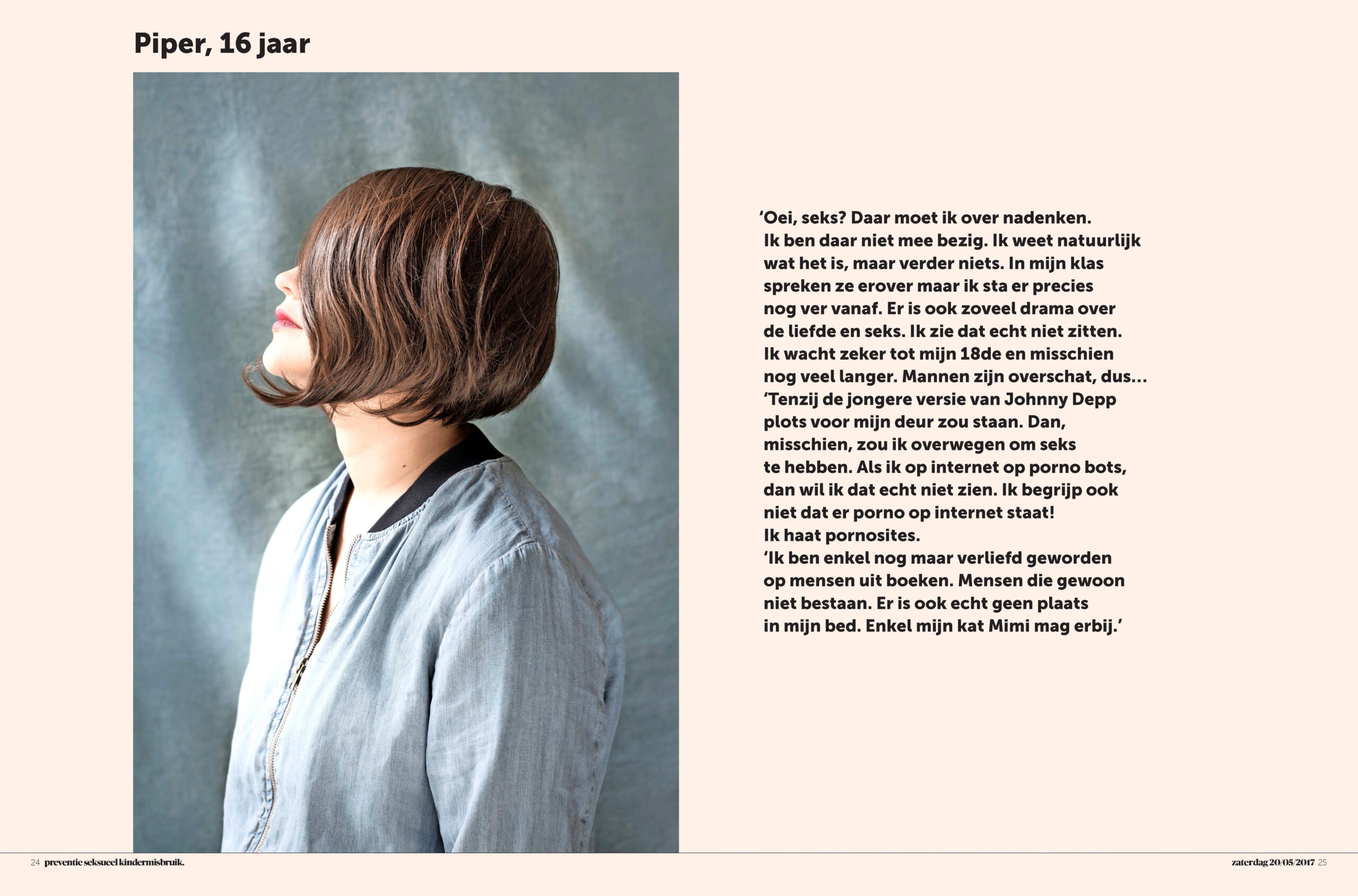
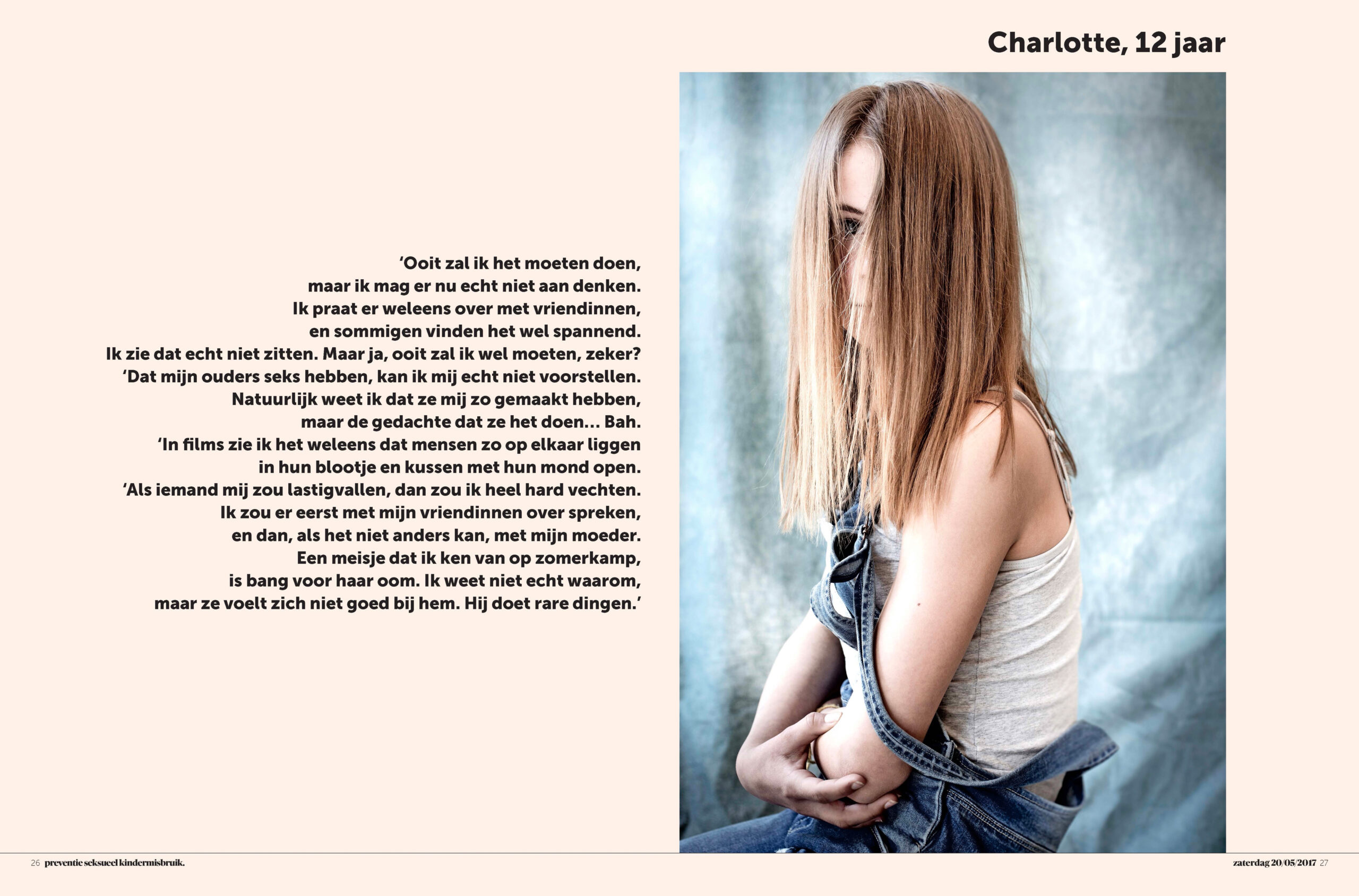
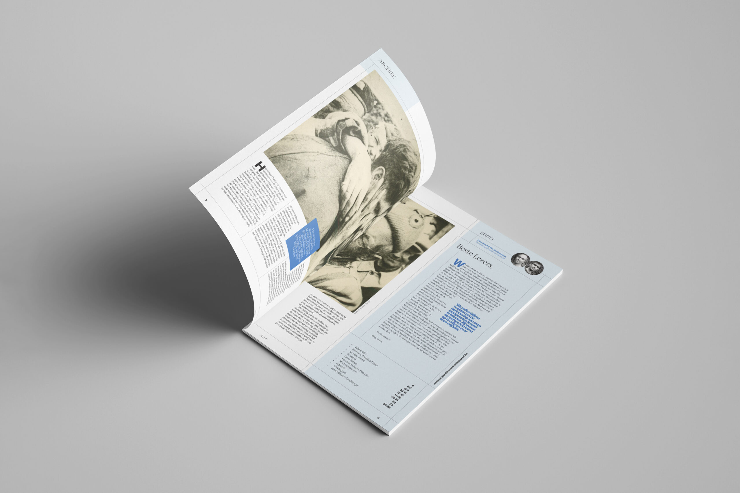
Supplement by De Morgen on sexual abuse–awarded Gold by the Society for News Design:
You’ve worked on both sides of editorial design — art direction within the newsroom, focusing on daily production, and conceptual design, building structural frameworks, templates, and layout systems. Where do you personally see yourself more strongly positioned: in day-to-day art direction or in classic editorial product design? Or is that distinction fluid for you?
I’m more comfortable conceptualizing — building structural frameworks and understanding how the newsroom works — while finding talented people who can do crazier and better things than I can, which makes the design much stronger. I love being part of the process, but even more, I love helping people reach the best idea. It’s great to have a team where every talent can flourish.
A newspaper shouldn’t be driven by one top-down voice dictating what everyone else has to do. It’s much nicer to see design evolve collectively. The most important thing for me is maintaining quality. When you have a strong concept, good typesetting, and well-built library elements, the team has all the tools they need to experiment — without risking chaos.
Spreads from De Morgen Magazine:
As far as I know, De Morgen is one of the three major newspapers in the Flemish-speaking part of Belgium. It’s seen as a progressive, left-liberal publication with a relatively large circulation by Belgian standards. Could you describe the size and structure of the newsroom? And specifically, how large was the visual team during daily production when you worked there?
I haven’t worked at De Morgen for two years now — I’m just consulting for them occasionally — so I’m not sure how big the team is today. What I do know is that it’s always been small compared to other newsrooms, which is why finding the right people was so crucial.
When I was art director, there were about 6–7 people working on the daily newspaper, 2 on the weekend editions, and 2 on the magazine. But things have changed a lot since then. I believe there are now only three people working on the daily.
In recent years, I’ve found that clear commitment from editorial leadership is essential for a strong visual strategy. Especially in times of financial pressure — when design is often seen as a luxury — there has to be a conscious decision to prioritize visual storytelling. From the outside, De Morgen has always appeared to treat design as part of its DNA. How was design perceived internally, and how strong was the editorial support for a visually driven approach?
I think De Morgen started as a newspaper where photography was extremely important. If you look at older editions, you’ll find a kind of photography that you couldn’t see anywhere else. Over time, that focus evolved — from photography alone to a broader perspective on storytelling through design.
For me, smart layout is key. When I started at De Morgen, layout seemed less important than it is now. The art director plays a vital role in defining how De Morgen should look and feel. The paper also wants to project a young and contemporary identity, which means you need people who are aware of what’s happening in the design world.
Today, you work as a freelancer and co-founded a company — Damnyou. — together with your partner. What led you to make the shift to freelance work, and what’s the story behind Damnyou.? What’s the idea or vision driving the company?
After about 15 years at De Morgen, I really needed something new. I had a great run and a lot of fun, but eventually I felt a bit bored and worried I might miss other opportunities. I wanted to be more active in the creative industry. My core business is still editorial design and redesign, but I think it’s important to work beyond your field — it keeps you sharp. 🙂
The idea started as DamnYouIndustries and had been in my head for many years. It actually started before I worked at De Morgen, but back then it was just a name. It grew into something real after I met my girlfriend Marlies. She’s great at everything I’m bad at: client contact, budgeting, project management — all the stuff many creative people struggle with. So we decided to build a collective. The main 'brand' being Damnyou., with sub-brands Damnyou.industries, Damnyou.editorial. Marlies is the heart of the operation, managing projects and finding new opportunities. For each project, we assemble the best people to collaborate with.
The idea is to skip the overhead of big agencies and work directly with clients in a more personal, flexible way. You can easily adapt the team to fit the client’s budget and needs.
We also built a van that we can work from — so no rigid office setup or corporate structure. The whole idea behind Damnyou. is freedom, creativity, and fun.
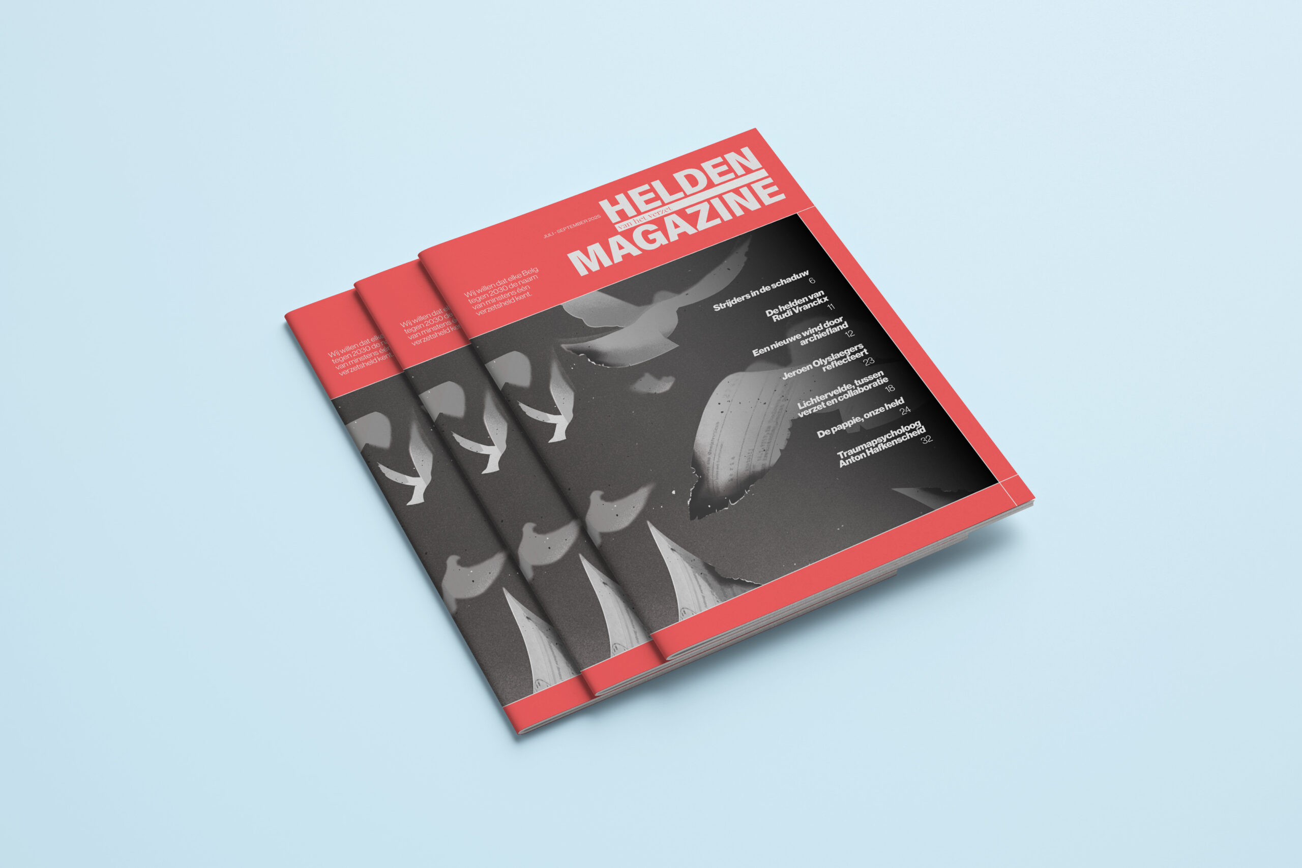
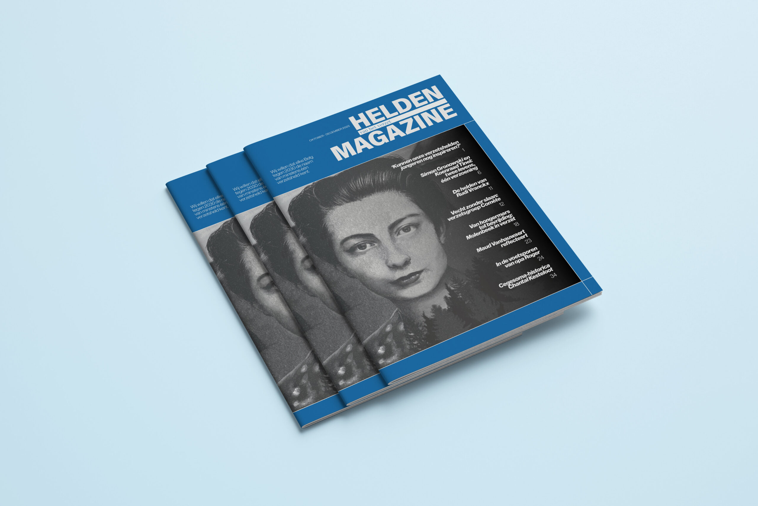
Helden van het Verzet–a tribute to the courage of ordinary people during the resistance against the Nazi occupation:
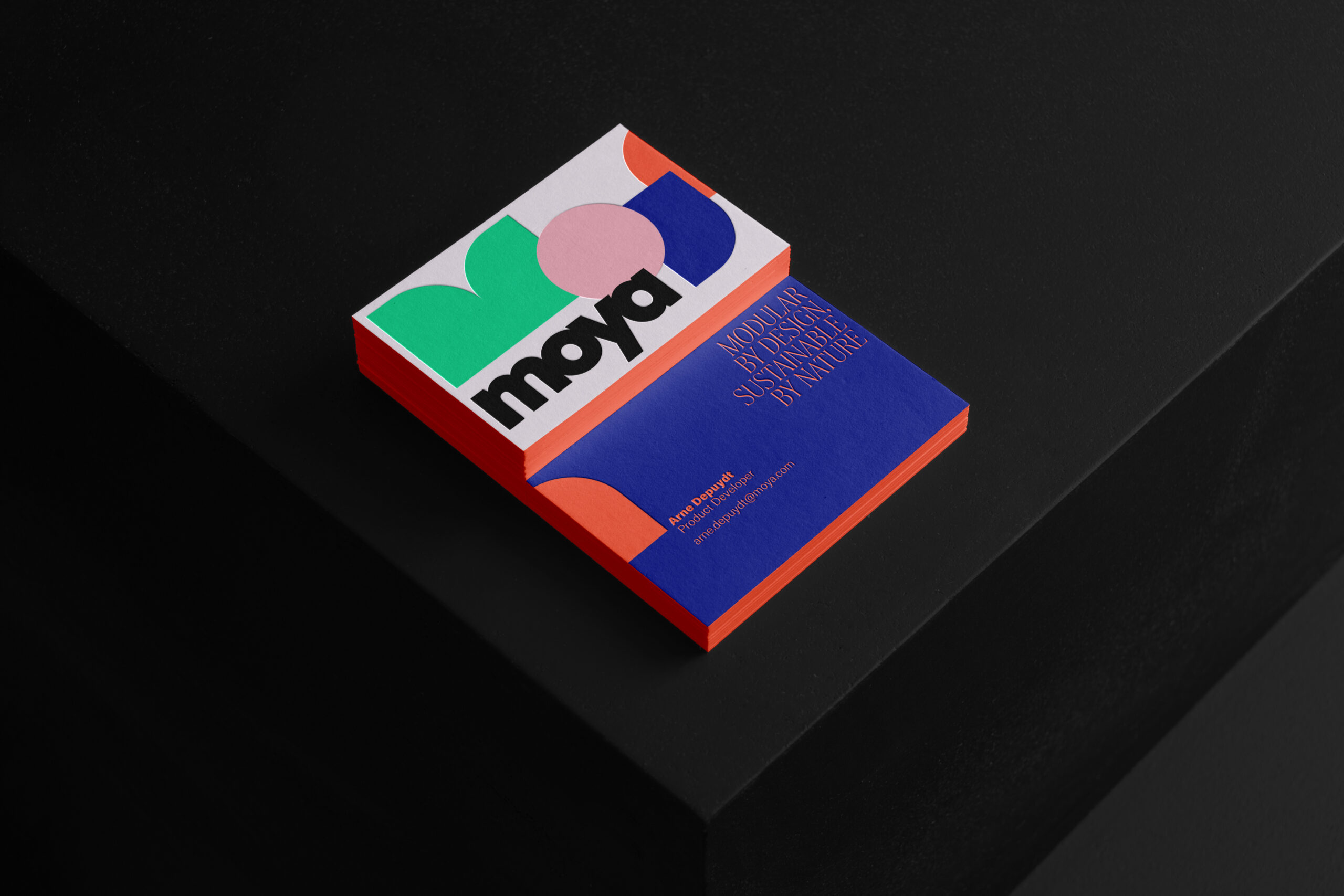
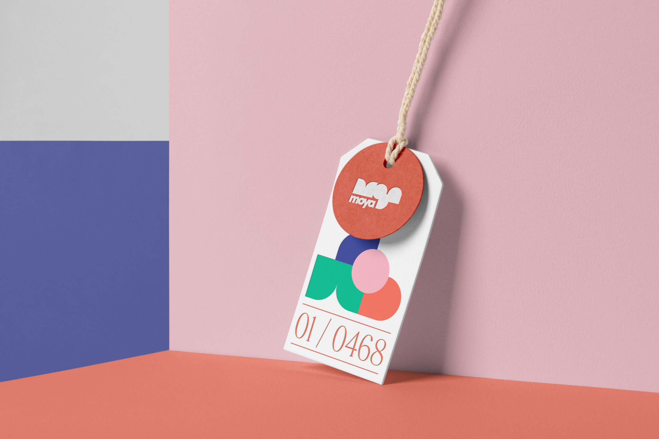
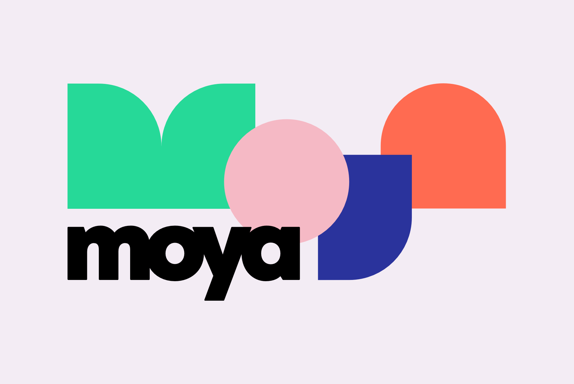
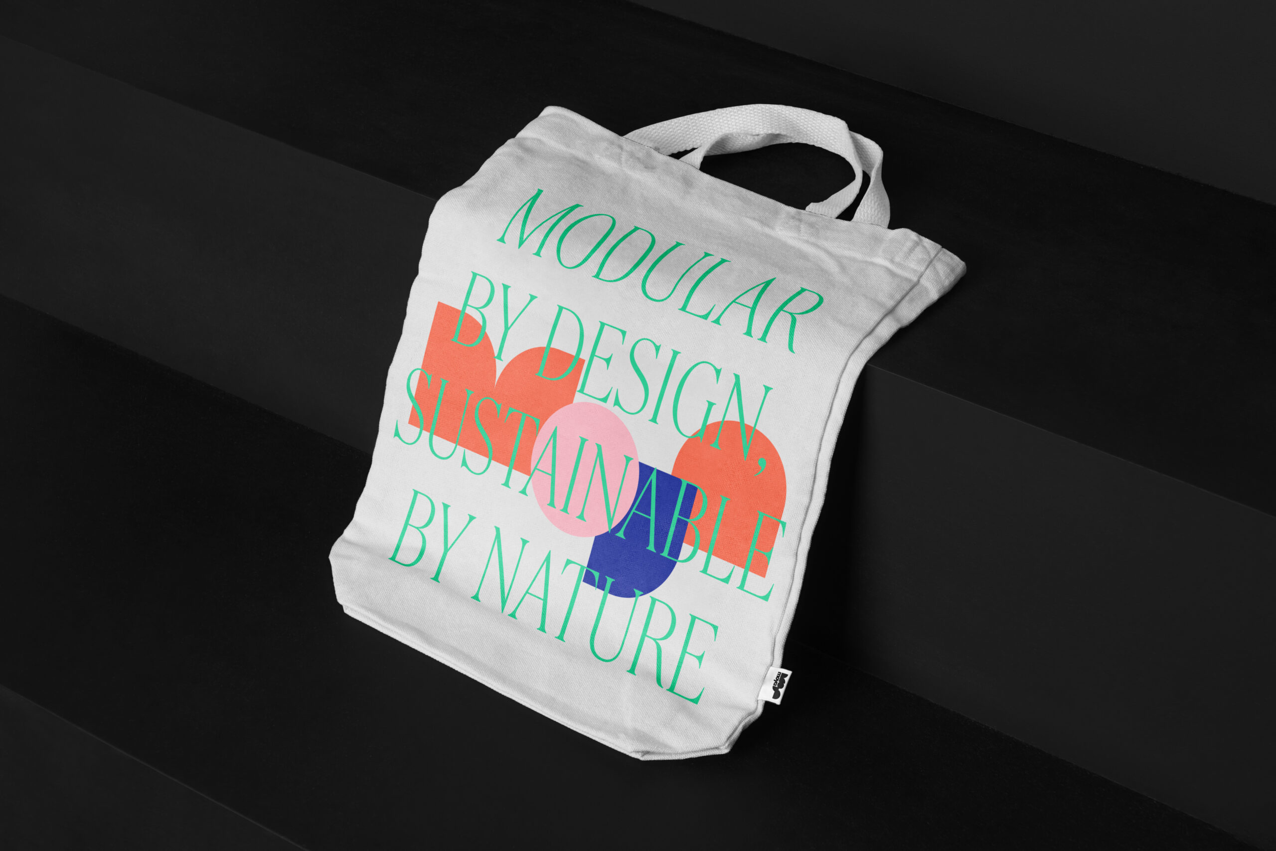
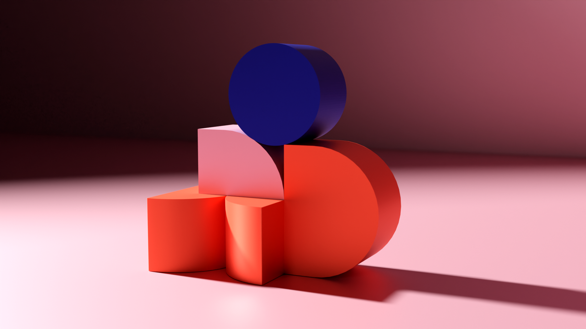
Visual identity for MOYA–Modular Object, Yield Analysis:
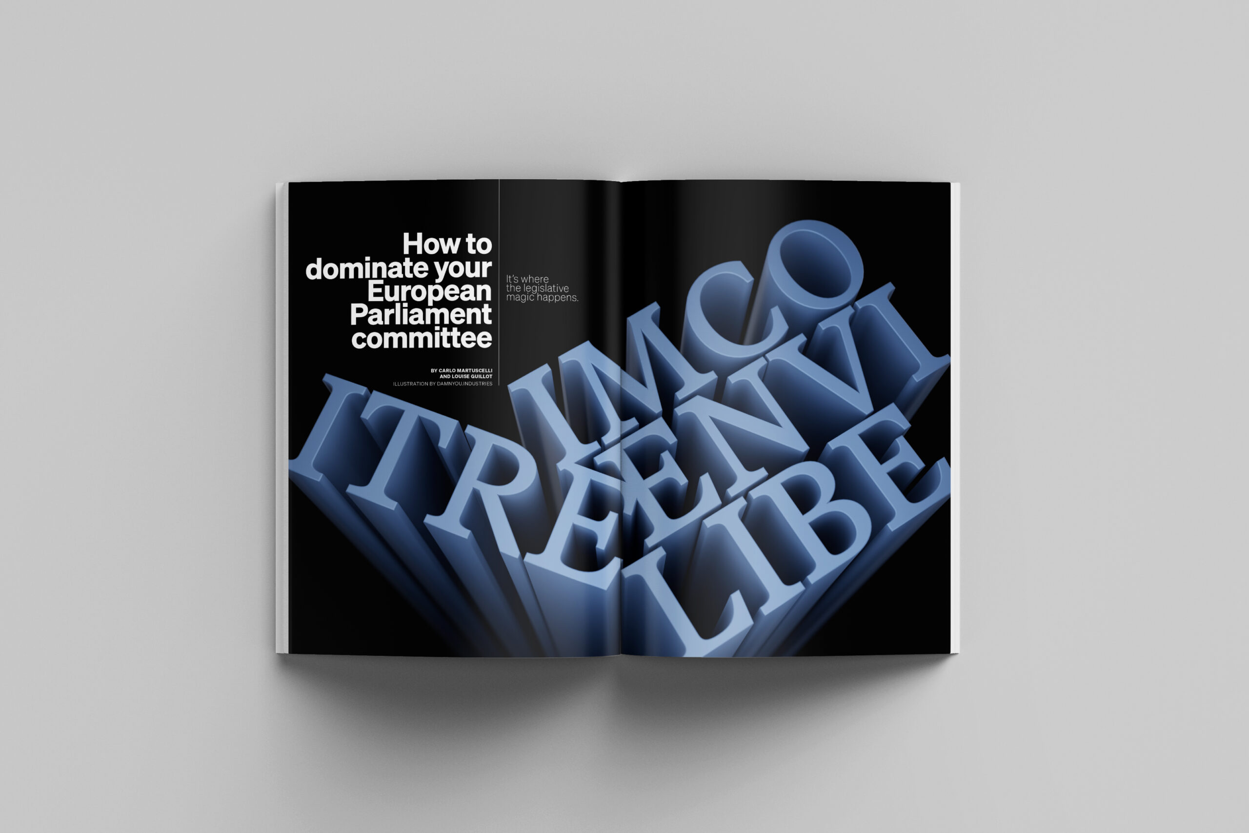
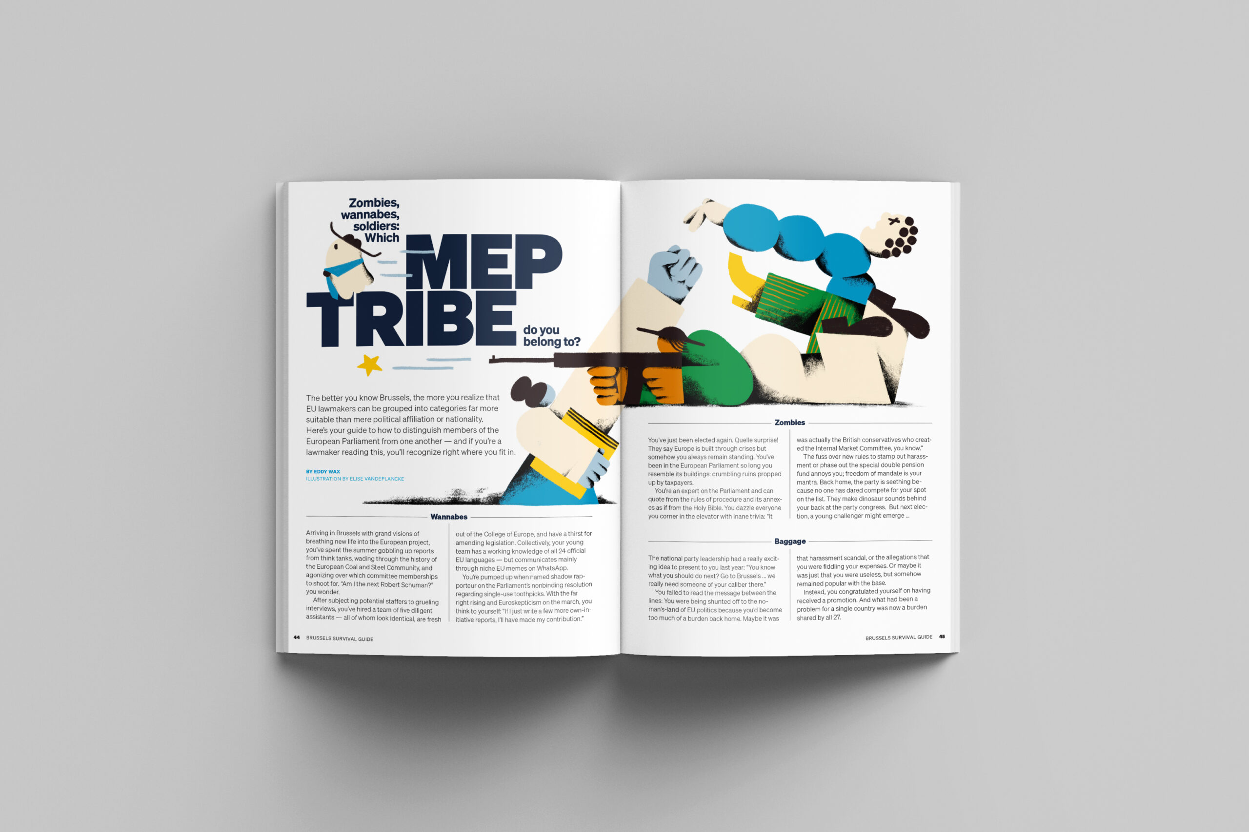
Spreads for Politico Europe:
Could you tell us about the projects you’re working on at the moment?
Right now, I’m responsible for everything visual produced by the non-profit Vzw Helden van het Verzet. It’s a truly important organization that focuses on forgotten stories about resistance fighters during World War II. For a long time, it was difficult to find information about the incredible things these people did to fight the Nazis — we’re trying to change that.
The biggest challenge was to develop a visual identity that feels miles away from the typical dusty, old-fashioned aesthetic so often associated with WWII. With full respect for the often tragic stories, we aim to present them in the freshest, most contemporary way possible. The goal is to attract new audiences, because the stories themselves are incredibly compelling. We produce novellas, a quarterly magazine, and even organize “resistance cafés.” They do a lot.
At the same time, I collaborate with my girlfriend within our collective Damnyou. There, we focus on a broader range of creative projects — working with 3D designers, motion designers, and others. Our goal is to find projects where we can combine our skills. Right now, for example, we’re creating visuals for a DJ set — fast-moving, eclectic, and electric. damnyou. is very important to me because it keeps me close to the latest developments in design. These days, I’m diving deeper into motion design, prompting, and related tools. Hopefully, I’ll be able to connect those new skills with my background in visual storytelling, which is still very much rooted in print.
Many publishers are automating print production, while in digital publishing the trend moves toward algorithmic personalization. How do you view these developments, and what do you see as the main opportunities and risks?
Personally, I haven’t yet seen the real benefit of algorithm-driven personalization. The main issue lies in the purpose of the algorithms themselves: they’re not designed to help you; they’re designed to make money. The people behind them often lack a moral compass — they act from individual motives without considering the broader societal consequences. This technology could be used much more intelligently, but that would require us to reshape the system first. Maybe we could start by rethinking the value of advertising. To me, advertising has no real value — and without it, algorithms would look and behave very differently.
That said, I also think some editorial teams operate in outdated ways. Defining an editorial line with ten people deciding what matters and what doesn’t might sound good in theory, but too often those decisions are based on shallow “click” or “view” analytics, or on narrow-minded ideas and principles. Once again, the underlying goal is attention — and money.
I think the truth lies somewhere in between. Let readers decide what they find interesting, maybe by forming small communities around shared interests — that used to work well back in the day. Such communities could be complemented by algorithms that surface relevant stories, but the whole process needs to be much smarter, more tailored — not just in terms of content, but also in the overall experience.
For me, an editorial team should above all be a trusted source: open, progressive, anti-political, but also capable of reflecting every aspect of society. Ideally, it should operate with a clear moral compass — a kind of manifesto that guides how news is created and presented.
From a design point of view, how can you make personalization feel helpful without losing editorial guidance? Can algorithms ever replace a designer’s or editor’s intuition about what’s important?
I certainly hope not — because if that ever happens, we’ve lost something essential as human beings. The complexity and depth of the human mind is the foundation of everything creative. Our ability to reason in nuanced ways, to make decisions, to compromise, to learn — all of that is shaped by feelings, impressions, cultural differences, and language. I truly hope we never lose that. We’re good at intuition — so why hand that over to algorithms? It’s not necessary.
How do you explain personalization to readers in a way that keeps their trust?
I’m not sure — but I think smaller, trusted communities could play an important role in that.
If everything becomes personalized, do we risk losing a shared public perspective? Do you see a future where human curation and algorithms work together, or will one dominate?
That’s the key question, I think. The challenge is to find balance — a way for human judgment and algorithmic efficiency to complement, rather than compete with, each other.
In Germany, there has recently been a heated debate between art directors and illustrators about the use of AI. Many illustrators oppose AI tools because the legality of training data — such as the material used by OpenAI — remains unclear. Their accusation is that large models are being trained on their work without consent. One art director who defended a more open approach even faced heavy criticism online. Have you followed these debates, and what’s your perspective?!
I find the use of AI for image creation quite complex. Maybe I can explain my thoughts in a few parts.
1. Inspiration and creativity.
When I started out, my mind was a blank page that slowly filled with impressions, experiences, books, films, and exhibitions. That personal “baggage” gives you the tools to work creatively. Most of those inputs were paid for in some way, so it feels okay to draw inspiration from them — as long as you don’t copy directly. I use what I take in as inspiration, not as raw material. I try to create something new, influenced by what I’ve seen. Of course, I might follow a style that was itself inspired by others — but how long, and in what way, should we keep compensating the original source? It’s complicated, and I’m not smart enough to solve it.
2. The ethics of AI training.
What doesn’t feel okay is the way AI systems are currently trained. Again, this goes back to who builds them and why. There’s a clear link to a world that’s gone a bit off the rails — where extreme energy use and corporate profit are ignored. These companies could easily use their resources to make the world better, but most seem focused only on gain. So it’s hard to believe they’ll compensate artists fairly either.
3. Using AI as a creative tool.
Personally, I use AI mainly as a tool. I’m exploring motion design, 3D, and simulations, and AI helps me learn faster. If I have an idea, I use AI to figure out the most efficient way to execute it. When I get stuck, I show it a screenshot and ask where the problem lies. For programs like Blender, that’s an absolute gift — I would never have progressed this fast without it.
I also enjoy experimenting creatively. For example, at damnyou., we created a birthday calendar using AI. I described each month abstractly, like a small poem based on its characteristics, and used those descriptions as prompts in MidJourney to generate images. The results were fascinating — poetic and dreamlike. That’s very different from just prompting “a plant in Van Gogh’s style,” which I find pointless. Maybe people using AI like that will eventually get bored, the hype will fade, and AI will remain as what it should be: a tool for those with a real creative idea, not a machine for copying others.
It’s a super complex topic — and it’s evolving fast.
Arne’s website: arnedepuydt.be
DamnYou’s website: damnyou.industries
Follow Damnyou. on Instagram: @damnyou.industries