
Tuomas Jääskeläinen
“What we are building is a visual platform for meaning, not just recognition.”
How can a logo be turned into a storytelling tool? Tuomas Jääskeläinen, Art Director at Helsingin Sanomat, talks about a campaign that just won Gold at the Society for News Design (SND) awards – a rare achievement for a non-editorial project. A conversation about bold design, the power of symbols, and how visual storytelling can reach far beyond traditional journalism.
Interview by Thomas Weyres
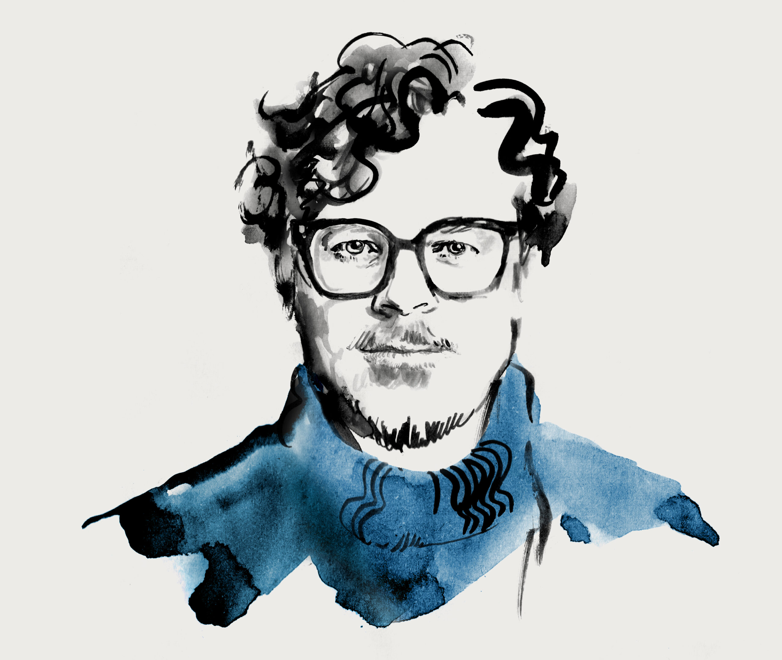
Illustration by Elisabeth Moch
I met Tuomas in 2023 in New York, I was serving as a juror for the Creative Competition of the Society for News Design, and after the jury sessions there was a conference at the Museum of Design, right across from Central Park. After my talk about the relaunch of Der Tagesspiegel, we got into conversation and have been in casual contact ever since. The interview was conducted via email.
Last year, you launched a brand campaign for Helsingin Sanomat that attracted international attention. It powerfully visualized the newspaper’s values – especially through the creative use of the logo. How did this campaign come about? What was the conceptual and design background – and in what economic or strategic context did you develop and launch it?
In 2023, our newly appointed editor-in-chief Erja Yläjärvi launched a new clear vision for the newsroom: we must focus on our core strengths. That might mean doing a bit less, but doing it better with full attention to what really matters to our readers. With that in mind we started planning for a new brand campaign for the next year.
We had done a lot of great marketing over the years: new product launches for different target groups, attention-grabbing campaigns reflecting our core values etc – a lot of it. Some of it really good and creative stuff but when we looked back at everything we’d done, we realized something was missing: continuity.
The answer was right in front of us: our iconic logo. It’s one of the most recognizable logos in Finland and full of meaning: history, trust, authority. But instead of treating it as something static, we started using it more dynamically.
Working with our agency partner United Imaginations, we built a flexible visual system around the logo: it can expand, shift, and interact with different kinds of content and formats, from digital to print. In some cases, it acts as a framing device, in others, it becomes a bold graphic element that leads the design. This approach lets us stay rooted in our legacy while still feeling fresh and relevant – whether it’s a new product launch or a brand campaign.
There’s been a bit of a trend lately in advertising to play with logos. One fun example I saw recently was from Kellogg’s in the UK. But not every brand can slice up its logo and still be recognizable. For us, it’s all about visual coherence on the outside and a story-driven brand experience underneath. What we are building is a visual platform that lets us communicate our purpose, and what we offer, in a more creative, meaningful way.
Poster from Helsingin Sanomat brand campaign:


As far as I know, you work as an art director not directly in the newsroom, but rather on the publishing side – focusing on the Helsingin Sanomat brand. How is your team organized internally? How closely do you collaborate with the designers in the newsroom and with product development? And how does this work strategically: Is there someone overseeing the visual language of the entire organization – both editorial and brand–in the long term, or do you operate more in separate areas or silos?
Yes, my home base is at the marketing department. My role is to oversee how the Helsingin Sanomat brand is represented across all consumer touchpoints. But I really enjoy that my role in the company isn’t super strictly defined – it shifts and evolves depending on every project.
I work closely with the newsroom, photo and video departments, our in-house marketing planners and designers, product designers and our advertising agency partners. On the editorial side, I’m involved in all major development projects and new product launches.
The business strategy sets the financial goals, and the content strategy defines our focus areas and tone of voice but the brand is owned by the newsroom: our journalism is the product. So ultimately, I report to the Editor-in-Chief and to Managing Editor Emma-Leena Ovaskainen, who’s in charge of design in the newsroom.
Sed diam nonumy eirmod tempor invidunt ut labore et dolore magna aliquyam erat, sed diam voluptua. At vero eos et accusam et justo duo dolores et ea rebum.
Stet clita kasd gubergren, no sea takimata sanctus est Lorem ipsum dolor sit amet. Lorem ipsum dolor sit amet, consetetur sadipscing elitr, sed diam nonumy eirmod tempor invidunt ut labore et dolore magna aliquyam erat, sed diam voluptua. At vero eos et accusam et justo duo dolores et ea rebum. Stet clita kasd gubergren, no sea takimata sanctus est Lorem ipsum dolor sit amet.
The “Land of Free Press” campaign:

HS’s creative marketing output is truly outstanding. For instance, you built a virtual newsroom inside video games popular among Russian audiences, and during Donald Trump’s first term, you placed billboards advocating for a free press along his potential routes during his visit to Helsinki. Are these kinds of campaigns developed entirely in-house, or do you also collaborate with external agencies?
Campaigns or “acts” like these always come down to the idea. That idea might come from someone in-house or from an external partner. We work closely with United Imaginations here in Helsinki, and they know it pays to be proactive with us–and we expect that. Other agencies also pitch us ideas from time to time, and we’re always open to that. One great example was the newsroom we built inside the war game Counter-Strike. That concept came from a creative at Miltton who happens to be a gamer himself.
These kinds of actions help us communicate our brand in a way that grabs attention. Getting attention for your brand these days is tough and it’s not getting any easier. But it’s crucial that these brand actions stay true to your brand’s core values. If you don’t get this right, they will feel forced or gimmicky and might even harm your brand.
At Helsingin Sanomat our values, freedom of speech, truth, and equality, were set already 135 years ago. They’re not just the backbone of our journalism, they guide how we show up as a brand.
The best ideas are always tied to something timely. The “Land of Free Press” campaign, for example, was pulled off in just two weeks!
Screenshots from Helsingin Sanomat newsroom in Counter-Strike:


The Helsingin Sanomat logo is typographically unique in an international context and has a strong visual presence. What’s the story behind the logo? Is it the original logo from the paper’s founding, or was it introduced later? If so, when and in what context?
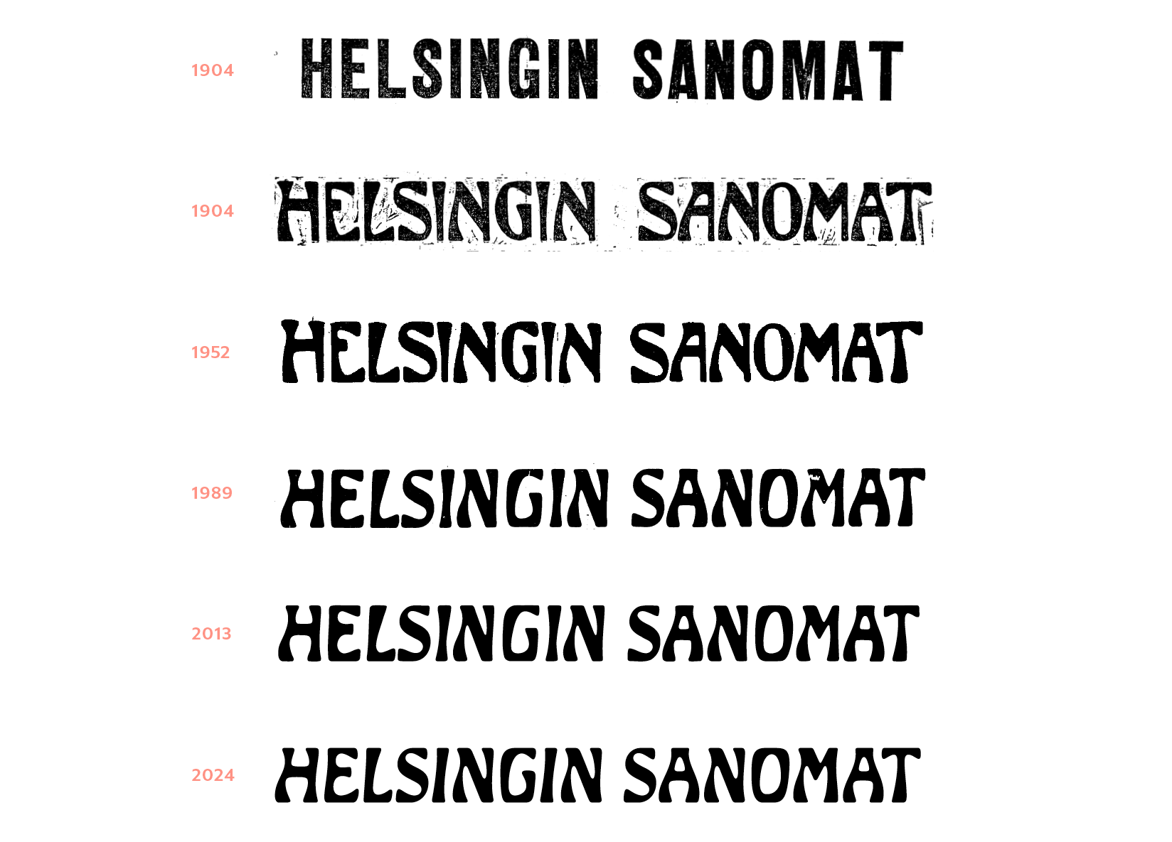
The logo dates back to 1904, when the paper began publishing daily again after a period of unrest. The designer is unknown, but it’s very much a product of its time, reflecting the Jugendstil (or Finnish Art Nouveau) architecture that Helsinki is also known for.
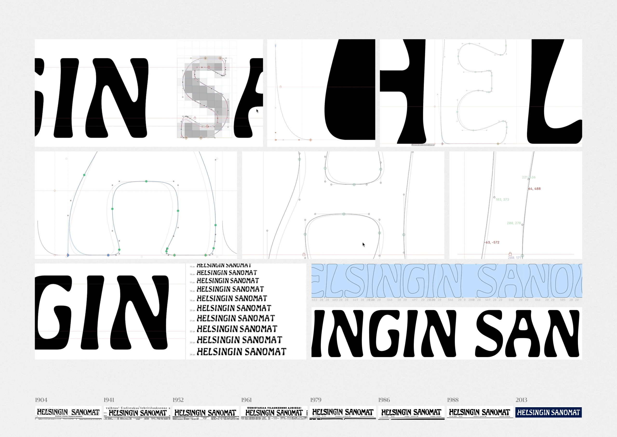
The logo was originally digitized back in 1989. When we started scaling up the letterforms for the new campaign, we realized how sloppy the original work actually was. So last spring, type designer Eino Korkala redrew the logo from scratch – now we can use it even at building-size scale. (He also created a version that works perfectly on mobile screens.)
So yeah, this is only the third time the logo has been updated in 130 years!
Evolution of the Helsingin Sanomat branding:
How do you measure the success of a campaign like this – and as designers, are you internally evaluated based on those metrics?
Our research team always tracks how our campaigns are working using different tools and studies. What I personally find most interesting in these studies is brand perception: whether the brand attributes that we want to highlight are actually resonating with the right target audiences. (Think attributes like “quality” or “approachability,” for example.)
We use that data a lot to help us make decisions, but as designers, we’re not judged just by the numbers.
You have a very diverse design and cultural background, as far as I know. How did you get into publishing, and what is it that fascinates you about it today?
I first studied photography, then moved on to graphic design and visual journalism – but from a very early age I knew I wanted to make magazines. I was mind-blown by the creativity and visual boldness of Finnish pioneer magazines I saw in the ’80s, like Image and City. I’ve also edited my school paper, painted graffiti, and documented subcultures in Helsinki.
I was lucky to land in my dream job! I worked as an Art Director and Design Director at various magazine publishers for 20 years before joining Helsingin Sanomat in 2019. Over the years, many of Finland’s biggest magazines have passed through my hands.
Every now and then I still get that same spark of excitement from a digital story or a printed magazine – just like I did as a teenager. But these days, what matters most to me is journalism. In the crazy world we live in, trustworthy journalism is more important than ever. I want my work to support that.
Publishing is, of course, a very broad field – but where do you see it heading in the future, especially in light of the major questions our industry is facing: the decline of print circulation, the rise of digital, the automation of layout processes in print? Where do you see your own future role in all of this–and, more broadly, the future role of printed media?
After two decades in the magazine business, even I started to feel like the game might be over. I was tired of constantly fighting against the slow suffocation of the industry. Still, I believe print remains a highly relevant medium well into the future. That’s why it’s disheartening to see so many publishers accelerating its decline by simply giving up on it. Layout automation is always introduced with the promise that it will free us up to focus on the fun parts – but in reality, it’s just about cutting costs.
I love a printed product because when you pick it up the whole world is right there in your hands, between just those two covers.
Lately, I’ve started collecting Finnish punk zines and other printed pieces that playfully misuse the Helsingin Sanomat logo – and there are plenty of them (earliest from the late 1970s) and I love them all! I’m planning to find a way to somehow use them in marketing our journalism.
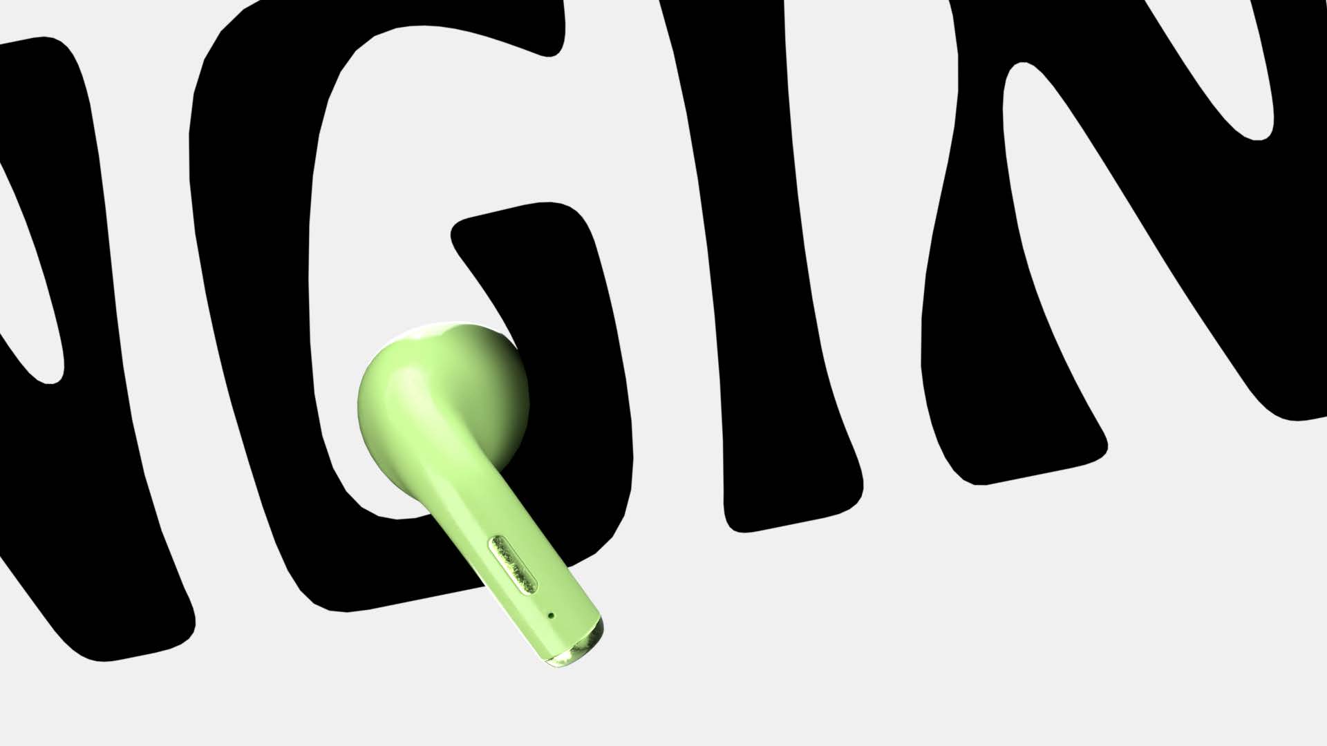
I’m an editorial designer who’s become a brand guardian. And that role is more important than ever, because the ways people consume media are changing really fast. This year, we’ve been thinking a lot about how HS translates into audio. We don’t know what the most popular way to read, or experience, Helsingin Sanomat will be a few years from now. But one thing is certain: however people find us, it should still feel unmistakably like Helsingin Sanomat.
AI will fundamentally transform the media landscape in ways that are still difficult to predict. That’s why the most important skill for the future is resilience: the ability to learn, adapt, and keep moving forward.
Podcast visuals:


Follow Tuomas on Instagram: @tuomasmas