
Anna Thurfjell
Why Trust Matters More Than Ever for News Media in a Rapidly Changing World
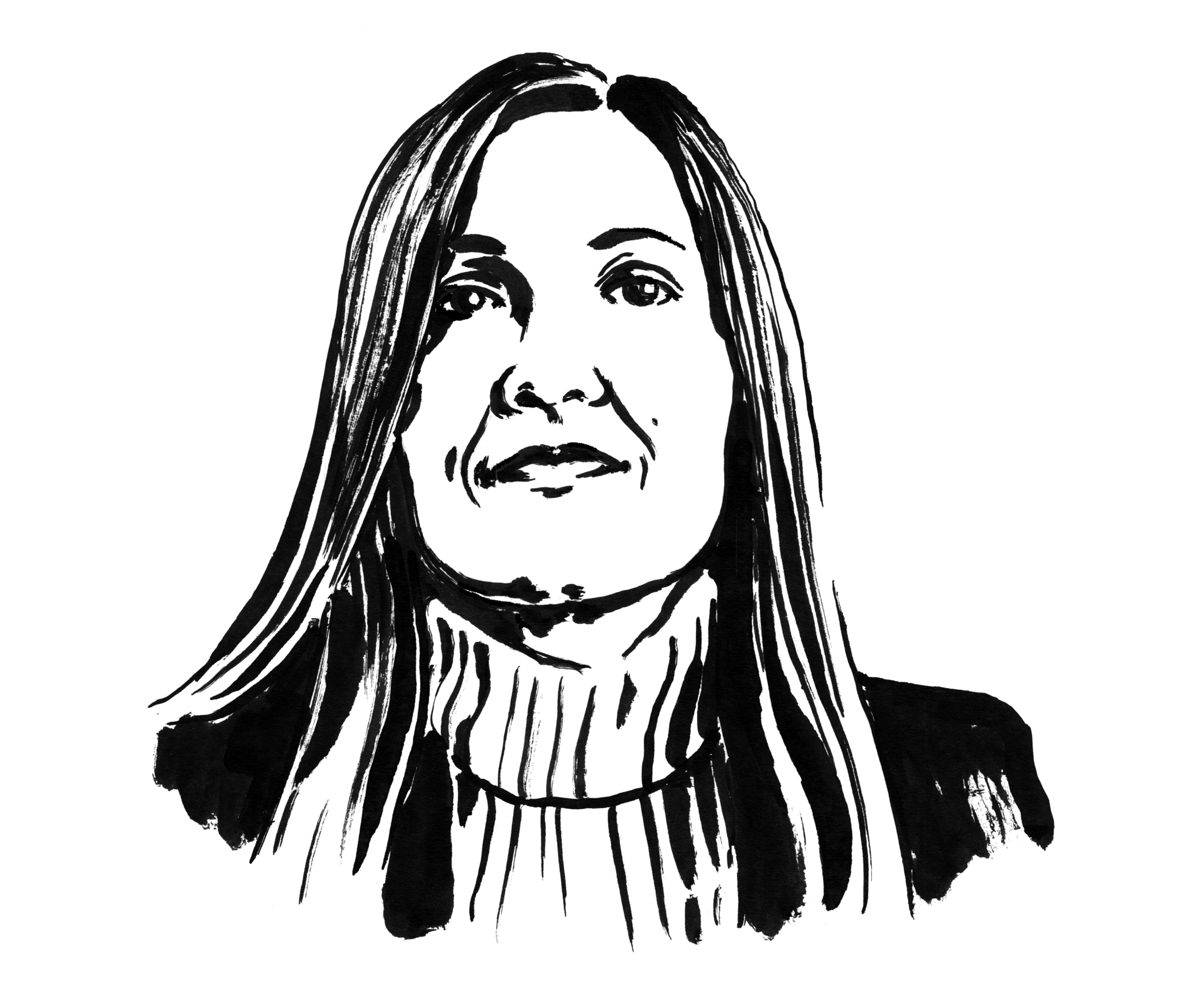
Anna Thurfjell is founder and Creative Director of a Copenhagen-based design studio specializing in visual identities for editorial media. With more than two decades working for leading titles such as Aftenposten, Berlingske and Svenska Dagbladet, she helps publishers strengthen the graphic DNA of their brands across print and digital platforms.
Interview by Thomas Weyres
Illustration by Jindrich Novotny
You’ve helped many of Europe’s most respected publishers navigate major shifts in the media landscape. When you begin working with a new media brand today, what are the first things you look for in its existing visual and graphic DNA?
I always start with the content and try to dive into who this is. Depending on the scope and scale, these are some of my “DNA tools”:
- To nail the DNA code, I often use a workshop called “The DNA Workshop”, a post-it method that begins with the question: Who are “X”?
- If it’s a redesign, I usually also do a design audit: what works vs. what doesn’t. If relevant, I also do historical research to find key design elements.
- The main differences in design are the publication’s brand design, the typefaces, and the level of visual sophistication the publication has, where type is critical for any news brand.
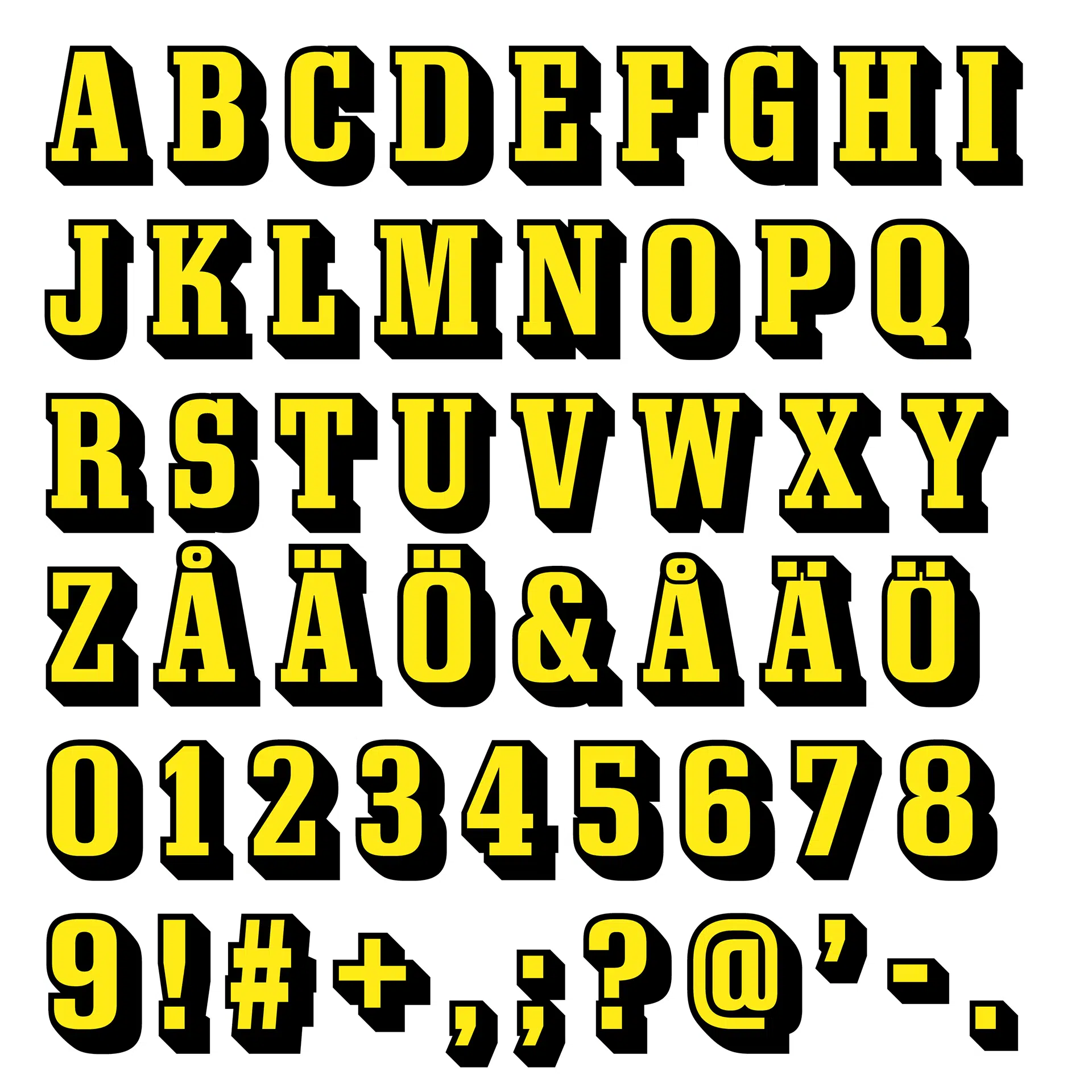
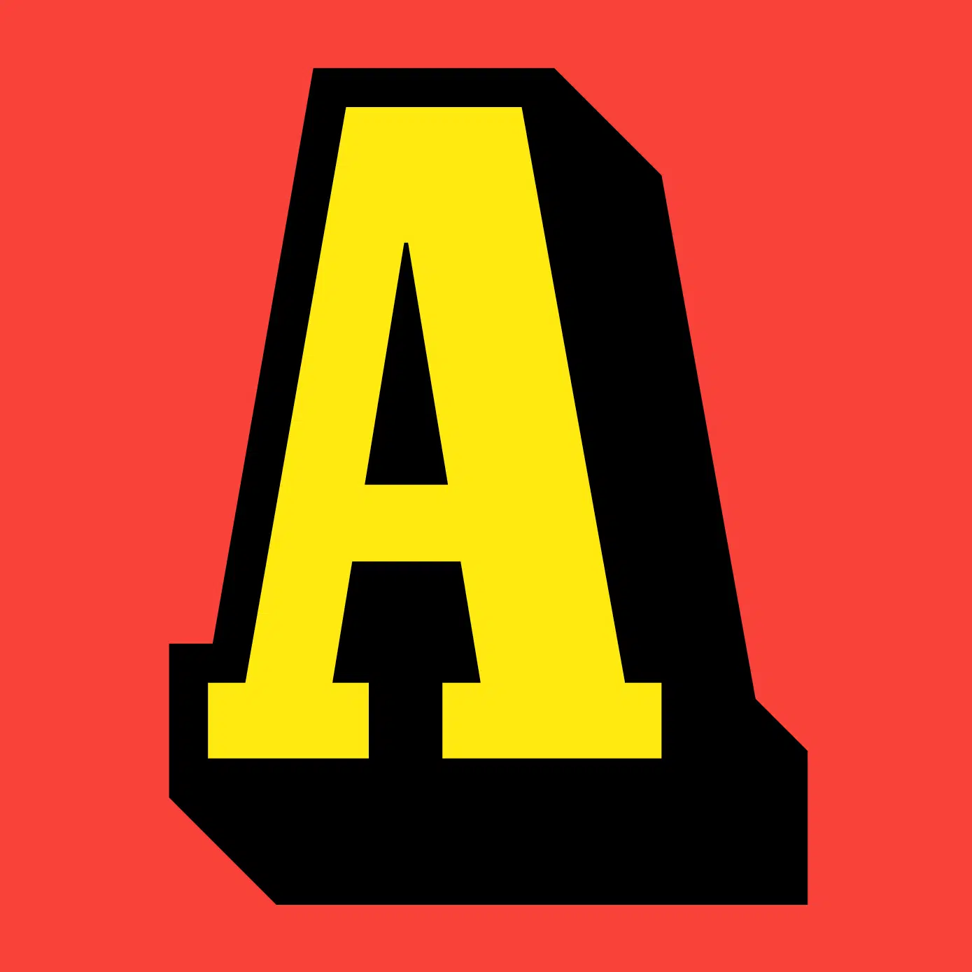
Brand refresh of Swedens largest news brand: Aftonbladet
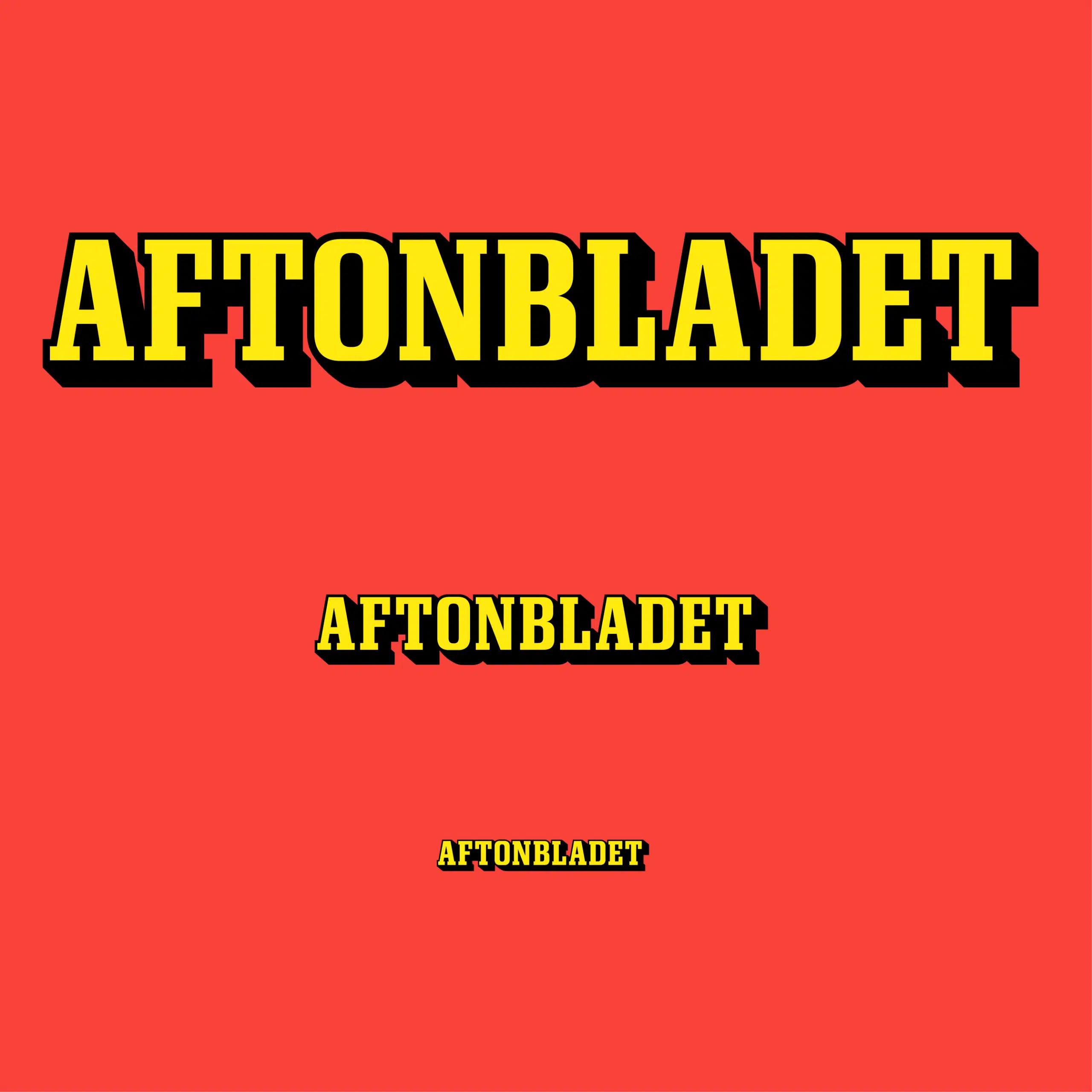
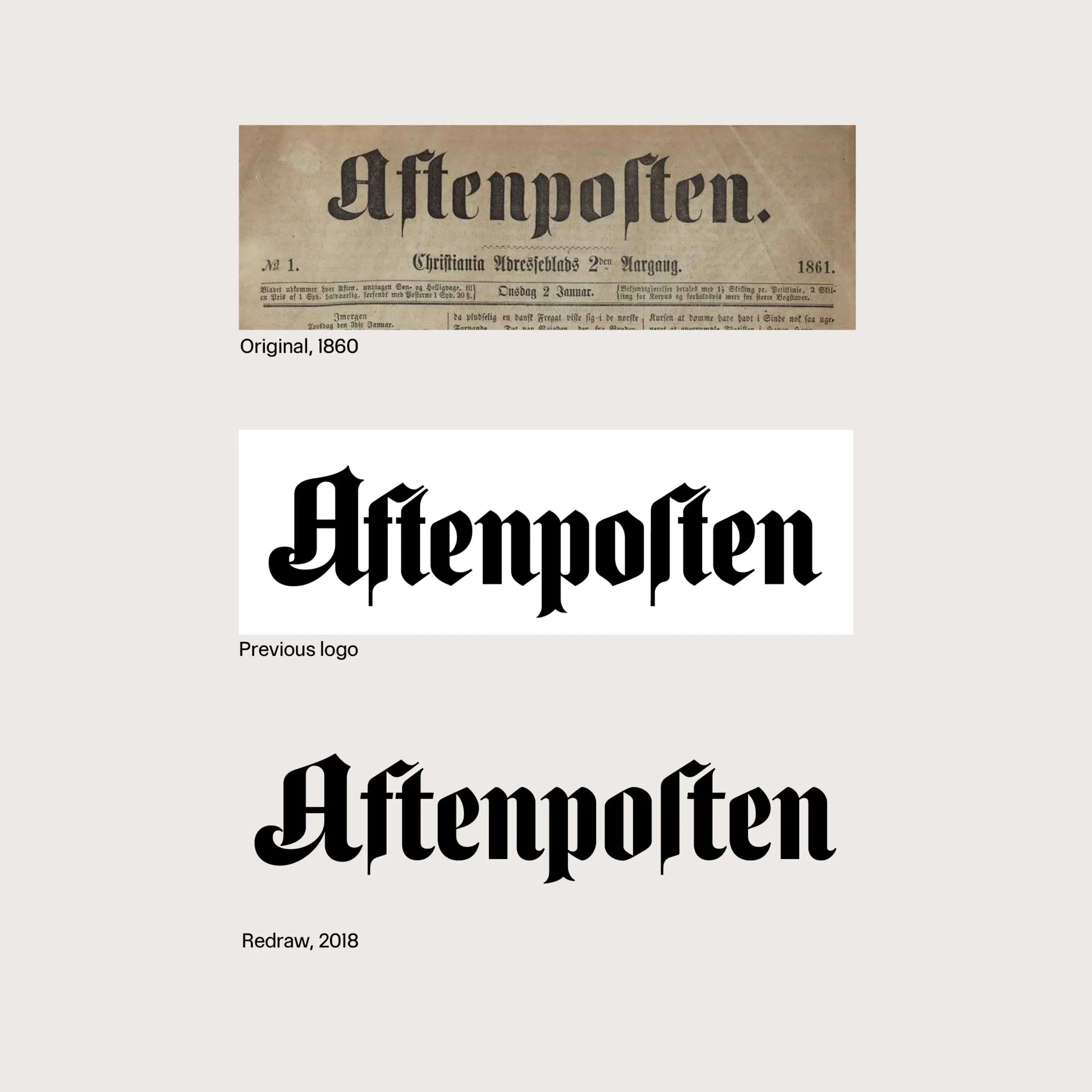
Redrawn logo typeface by Christian Schwartz at Commercial Type
Your studio describes its mission as designing “brands you trust” through distinct typography and clear design systems. How do you translate that philosophy into the specific needs of news organisations and publishers? “Trust is more essential than it ever has been for news media.” Our time is challenging for news media in many ways: the world is changing at a rapid pace, and new AI technology affects the news industry and the world at large. Trust is a key value for news brands to differentiate themselves from media you can’t trust and to help readers navigate a more complicated world.
Most news organisations are currently occupied with AI, but they should also care about trustworthy design. Design can help a brand be experienced as trustworthy, and trust can also translate into design. It’s a matter of trustworthy typography, brand design, authentic news visuals, and clear information graphics.
It is also about function: how is it experienced in our current time? Does the brand and product appear trustworthy across all platforms, and is it easy to get an overview of the news?
Sed diam nonumy eirmod tempor invidunt ut labore et dolore magna aliquyam erat, sed diam voluptua. At vero eos et accusam et justo duo dolores et ea rebum.
Stet clita kasd gubergren, no sea takimata sanctus est Lorem ipsum dolor sit amet. Lorem ipsum dolor sit amet, consetetur sadipscing elitr, sed diam nonumy eirmod tempor invidunt ut labore et dolore magna aliquyam erat, sed diam voluptua. At vero eos et accusam et justo duo dolores et ea rebum. Stet clita kasd gubergren, no sea takimata sanctus est Lorem ipsum dolor sit amet.
Your experience ranges from leading the visual identity of Svenska Dagbladet to advising titles in Sweden, Denmark, and Norway. From your perspective, how have Scandinavian media brands influenced global editorial design over the past decade?
Yes, I have been fortunate to work with the Nordic countries. With Stockholm as my hometown and living in Copenhagen today with my family, it has been a natural starting point for the studio’s first 10 years.
To answer your question: I think the Nordic countries rest on a long design tradition. Nordic design – or “Scandinavian design” – is known for its simplicity, modernist approach, and functionalism at the centre, as well as a certain calmness often inspired by nature. This also translates into editorial design, typography, fashion, and so on.
However, a chair is a chair, and Scandinavian chairs are world-class and appreciated in Japan too. What I think is that many of the design values in the Nordics are universal, and expectations of editorial news design are increasingly global. I like to think that design is a wave and that we learn from each other, so in the end it can be hard to say what is truly Scandinavian or Japanese chair design.
Some of the Nordic editorial brands I have helped – like Svenska Dagbladet (SE), Aftenposten (NO), and Helsingin Sanomat (FI) – have a high ambition in design. These are news organisations focused on brand design, typography, news design, and visual journalism. Hopefully some of this design has spread – or will spread – like a wave, creating more waves.
When working on a redesign project such as Aftenposten, how is the collaboration with the newspaper’s art direction typically organized? From my experience, this requires a great deal of sensitivity and diplomacy between the external expert brought in for the relaunch and the in-house art direction team, who will ultimately work with the new design on a daily basis. What has your experience been?
Yes it’s delicate and demands sensitivity. I would say I typically strive to establish a close working relationship with the editorial and design team. A key method is to work on a digital pilot or print dummy together. Projects are people so its about respecting people and identifying what everybody can contribute with. To my best knowledge if we share an ambition, understanding and interest in design anything is possible.
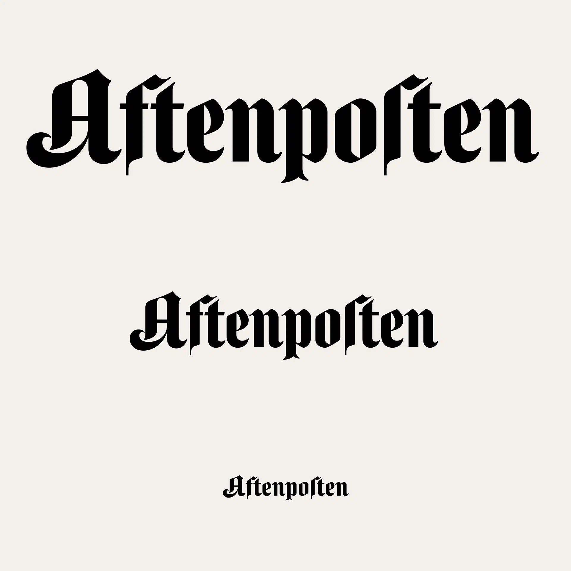
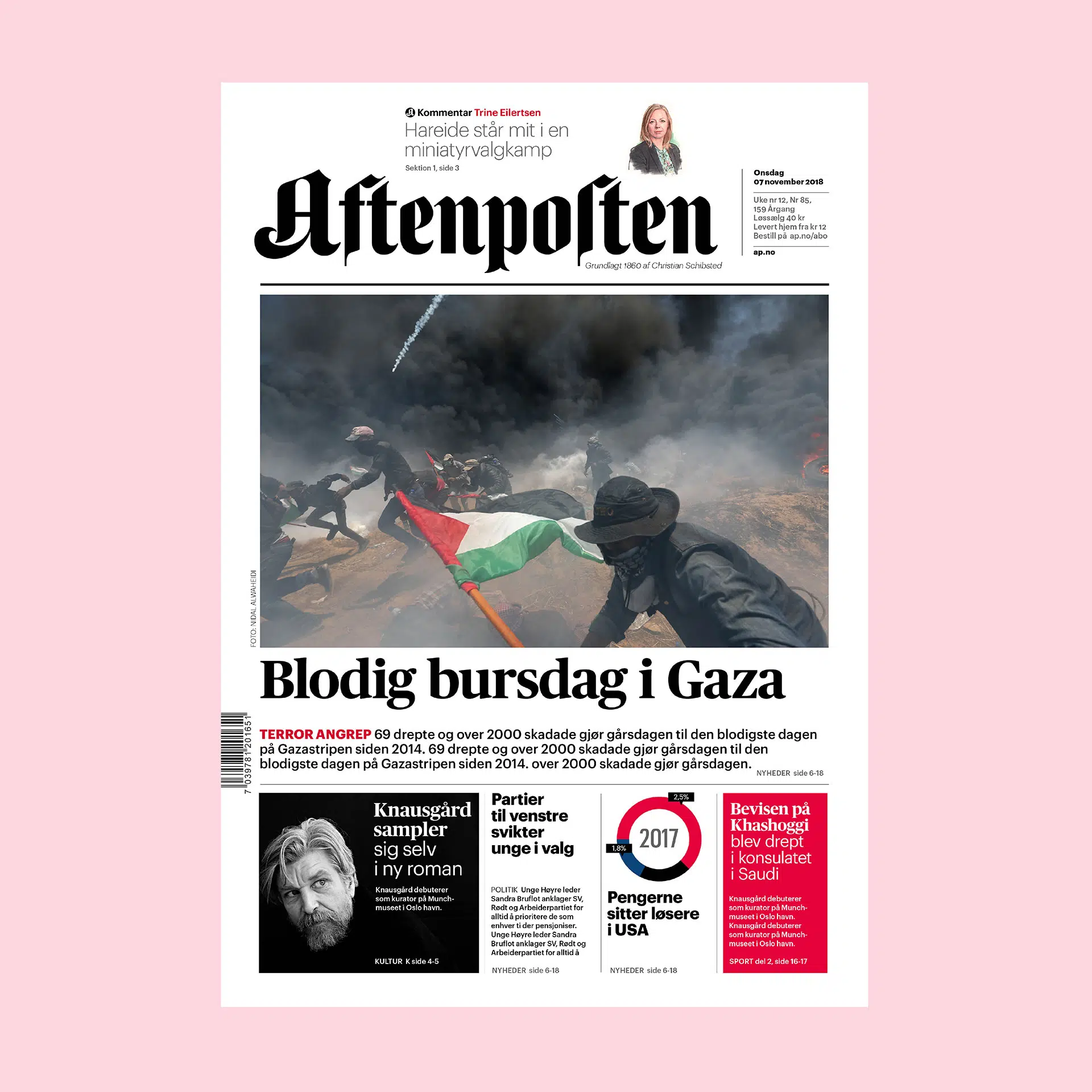
New logotypes for Aftenposten in print, digital and beyond.
You work very closely with Commercial Type — how did this collaboration come about?
Type is music … and Commercial Type are really experienced in editorial and custom type and they keep on designing impressive typefaces and its a studio with a great culture of collaborative work, so it’s evolving for me as a designer too.
From a typographic perspective, I currently see two strong trends in Germany, both largely driven by economic pressure: large brands are investing in custom fonts, while many smaller publishers can no longer afford retail font licensing and are switching to Google Fonts — often at the cost of typographic identity. I also have the impression that the retail-font business model used by many foundries, where costs are often tied to the number of page impressions, no longer works for many publishers. In an era of AI-generated summaries and AI-driven search, reach is no longer the primary KPI. What could alternative models look like?
There might be other ways … and I agree there are too many models today: open source, subscription models, and the traditional EULA licence model. It’s really a lot of work to explain this to clients.
The one thing clients really need is professional help testing type and design. My approach is that good typefaces cost money. If a news brand does not want to invest in type, it’s really the same as not investing in design – it’s such a major part of the design.
As a designer, I often ask myself how fluid the output of a news outlet needs to be — in other words, what design systems should look like if they are meant to serve as the backbone for visual expression across all touchpoints. Ten or fifteen years ago, the dominant approach was “mobile first”; five years ago, it was “social first.” Where do you start today?
We live in a mixed reality with fractioned information and who knows exactly what the future holds? Storytelling in news are driven with video, motion and sound today. It’s a lot to take into account to design news media brands today; video, motion, sound, tv, digital products and print editions, SoMe, newsletters and beyond. Still mobiles are people main news source because it follows us everywhere so it’s a clear starting point that is limited in space. Think Sony Walkman; if you could design the perfect news product with a clear overview of what’s going on in our world!
Many publishers are currently focusing on automating print layout. I think the role of the layout designer in the newsroom is one of the most endangered positions in news organizations. How do you view print automation? Are you working on any concrete projects in this area?
My studio did a large-scale project for 80 newspapers in Finland just a few years ago. The project scope was to create a new look and feel and to reform all Mediatalo Keskisuomalainen’s newspapers – nearly 80 – into one design system, enabling the group to share stories faster and publish them simultaneously in digital and print.
This was simultaneously a digital project for 60 news brands that was awarded a Red Dot Award.
Anna's Website